Things come apart
First photo shoot which I have completed
Final Shoot - Bases upon chocolate bars that break into seperate pieces

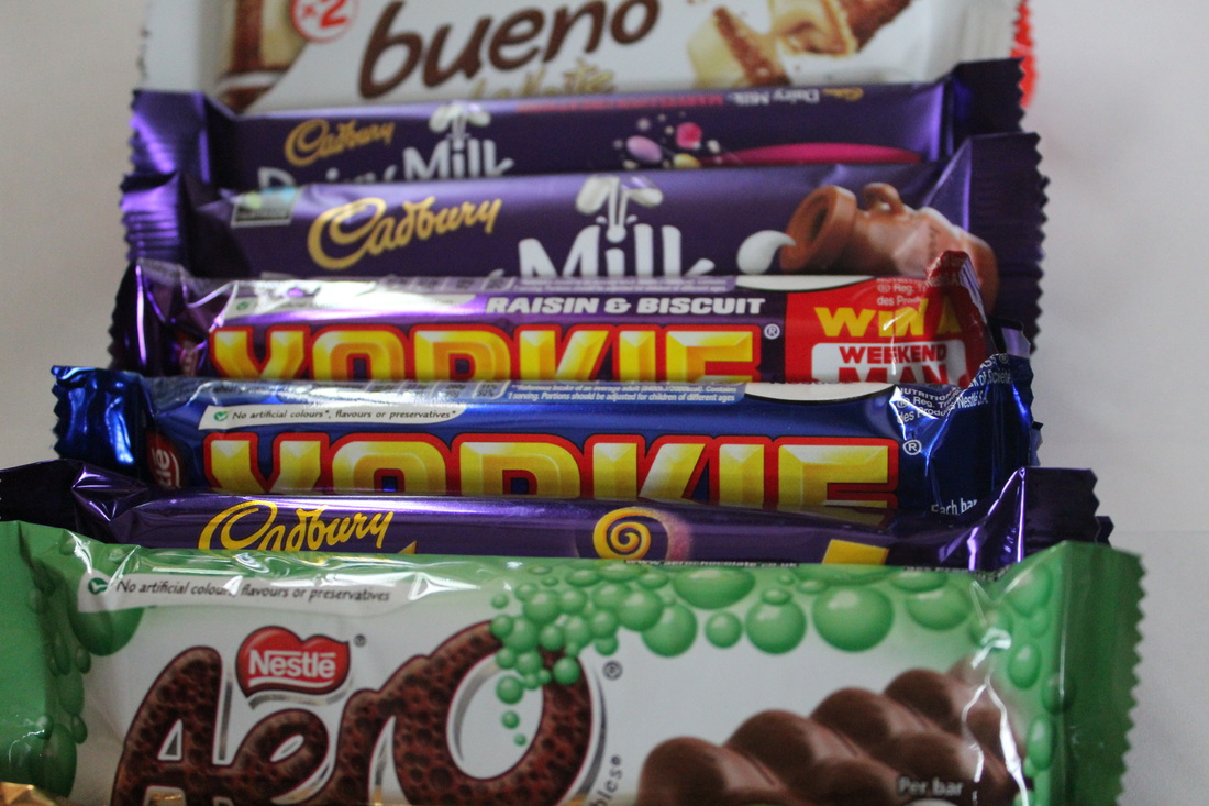
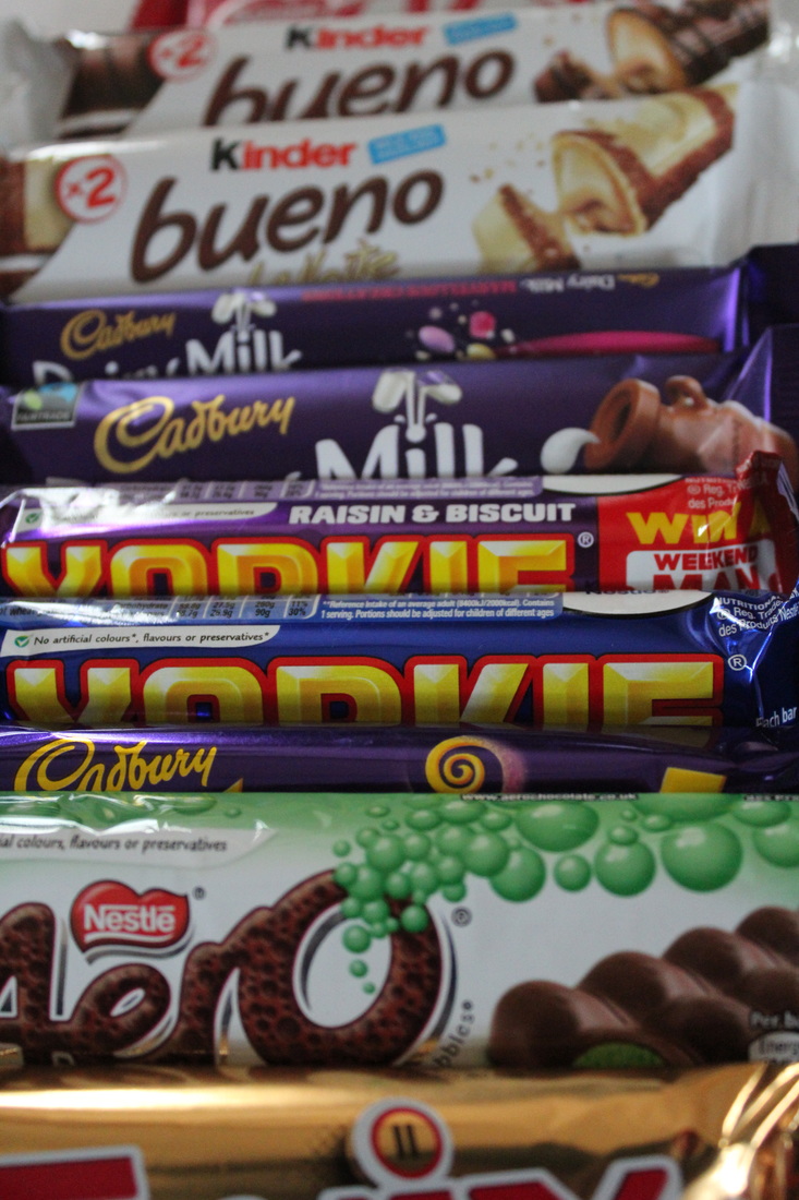
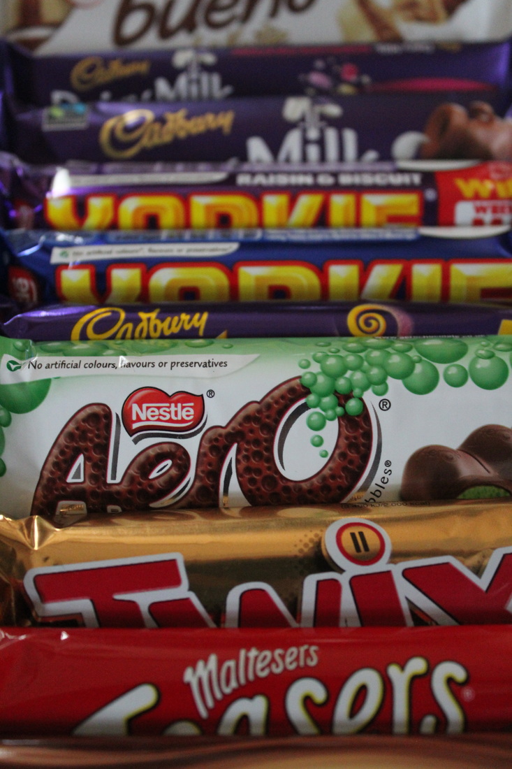
Contact Sheet
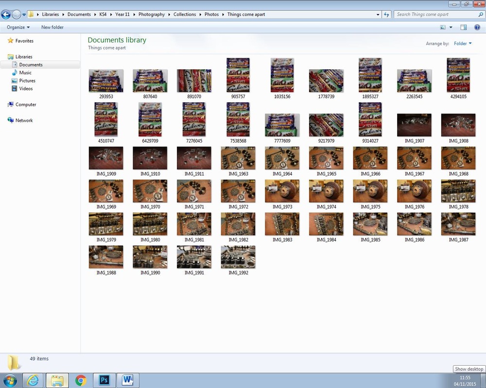
Edited Images


Annotation of Edit
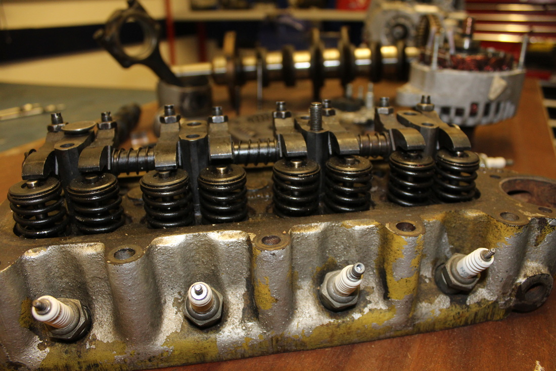
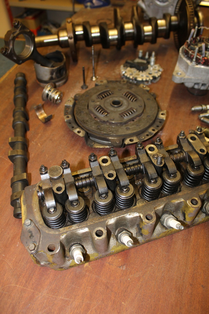
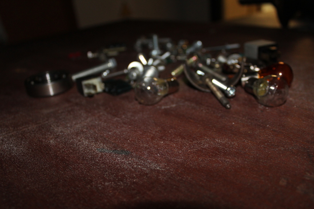
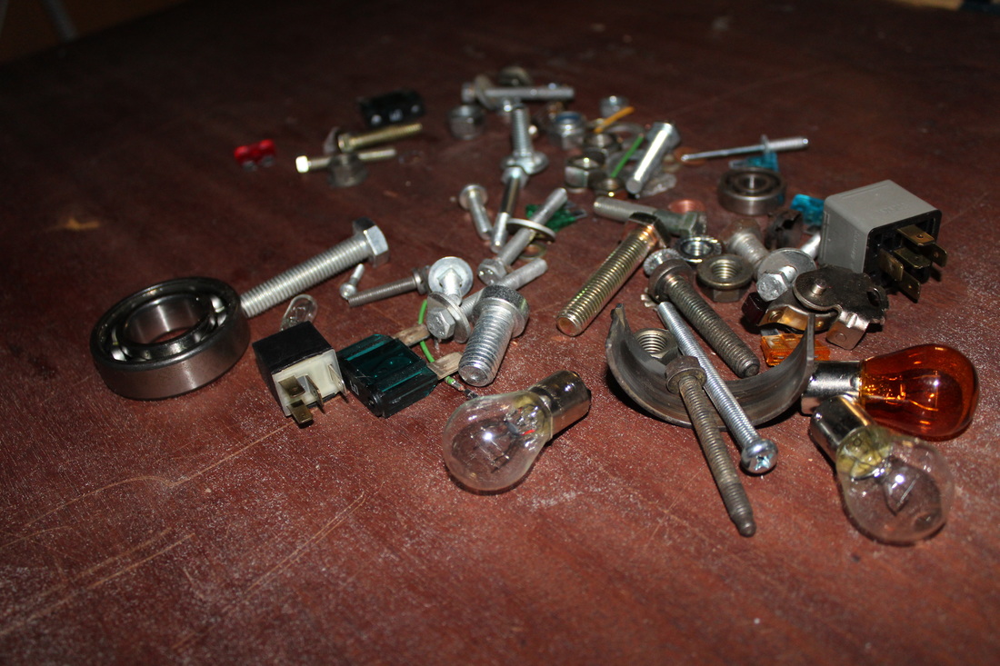
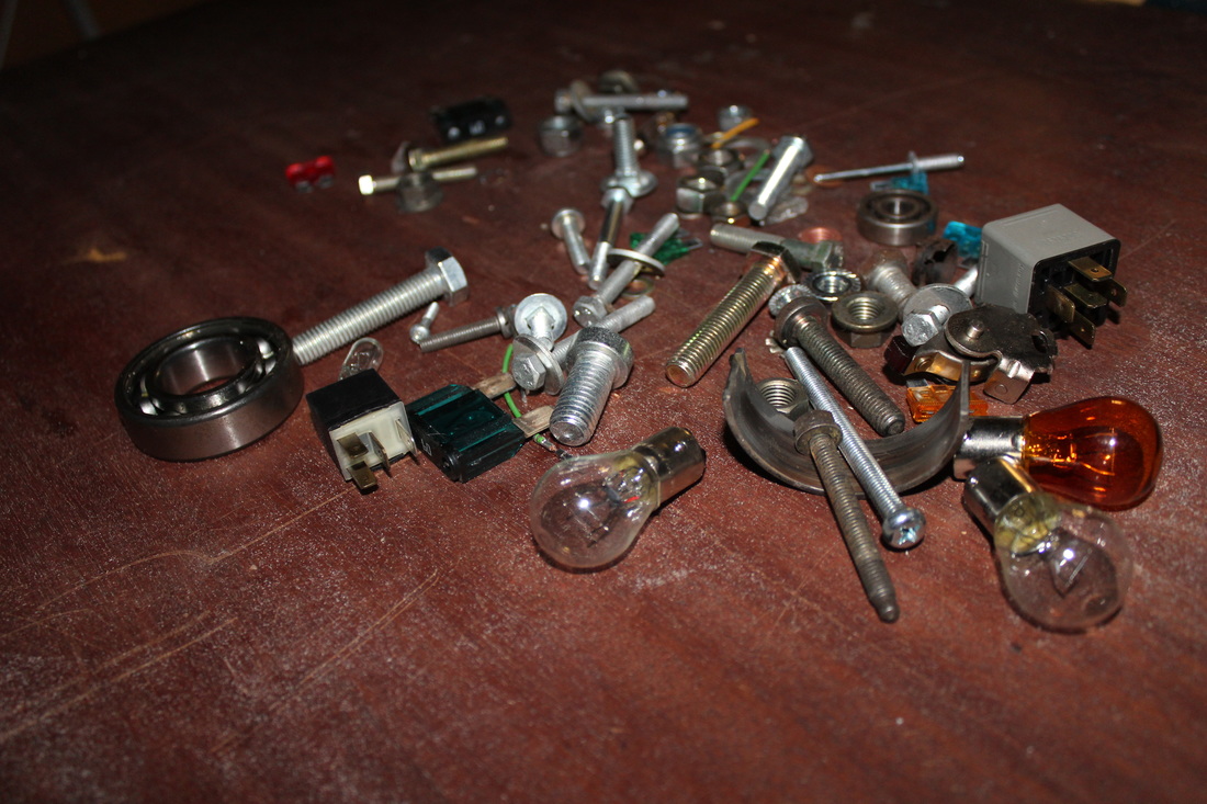
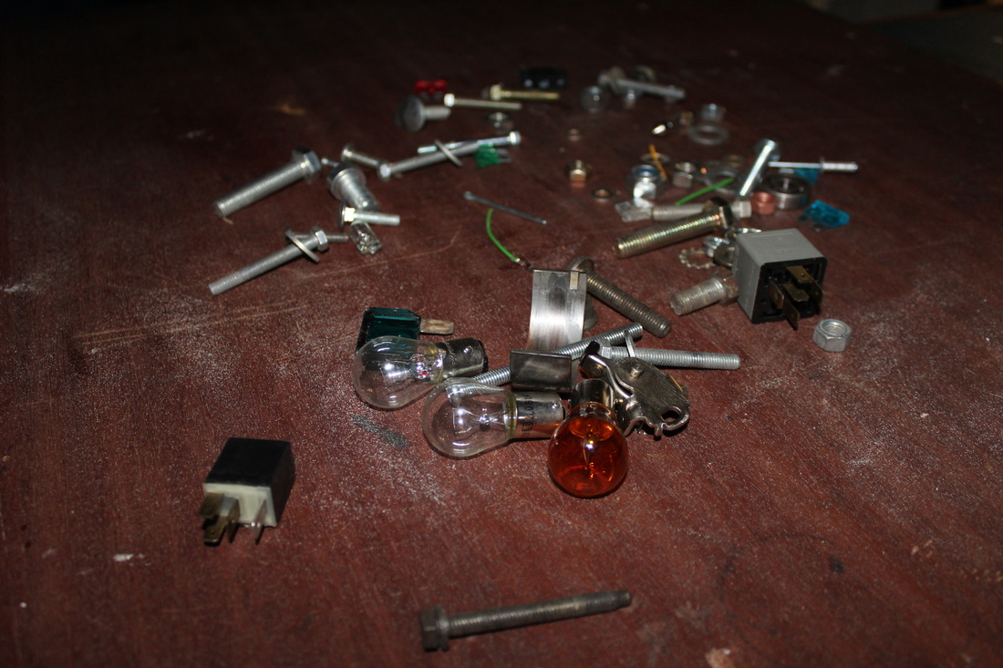
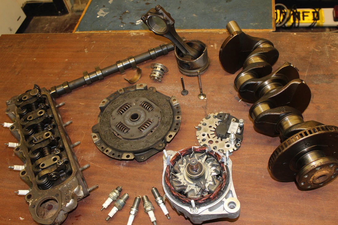
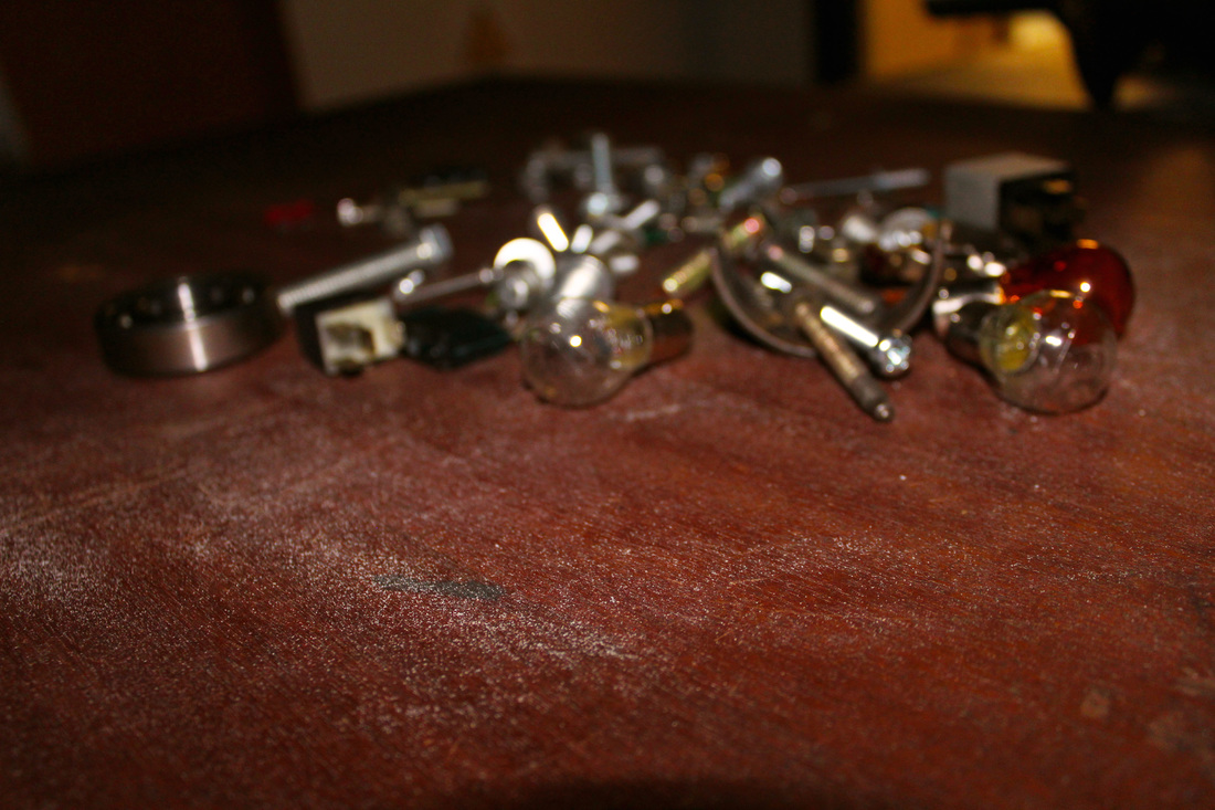
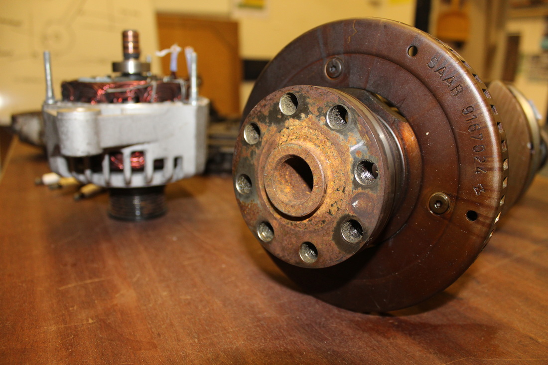
Within this photograph I was attempting to create an image which shows a variety of objects together in a group but making sure the camera captures each one. By using depth of field, I focused on the dust on the table which directs the audience from the objects to something else but always keeping in mind what these random objects mean. To capture this image, I used the close up setting on a Canon 1200d which focused on the whole area of the place I was trying to capture. This photograph was taken in the evening to make the room darker but there was no light so we could see the dust clearly and how the objects are positioned on the table randomly.
The work of Todd McLellan influenced me in completing this piece due to his previous work such as the organized but disassembled hoover or the chainsaw but still keeping the audience knowing what the original object was. However to make my image different, I put together objects which were different and did not make one object as a whole which shows that I have taken his idea and created it into my own personal way but still following the topic of collections. The tone in his photographs was light and used on a blank white space but I decided I would put my objects in their orginal space or on a surface which showed depth of field with the dust on the table.
I feel that the composition is effective due to the fact that I used the framing of the camera to show all of the objects and the dust on the table but include the light from the room outside to show how I have changed the lighting of the room to create effect on the image. Once taking this image, I kept it because I knew that it showed a strong depth of field but with the dust being the main image, the objects stand out on the table and makes the audience think about why the photographer has taken the image. When placing it into Photoshop, I kept the image the same size but I changed the brightness and vibrancy to make sure the table was brighter to keep the dust standing out and also making the light from the other room as an important part of the photograph.
The contrast of tone and colour within this piece shows how the light from the other room connects with how one part of the image is dark to show how these objects all connect within each other. The emotion created in this photograph began with a dark mood with not much light being shown but after editing through Photoshop, I made it brighter with brightness and vibrancy to show how the dust and depth of field can change the way the audience see the image and how it is presented on the page.
In order to refine and develop this piece I would add something like another image that shows how it relates into the topic of collections and how Todd McLellan uses organized objects which relates to how I have used a variety of objects but I have made them so they are not similar.
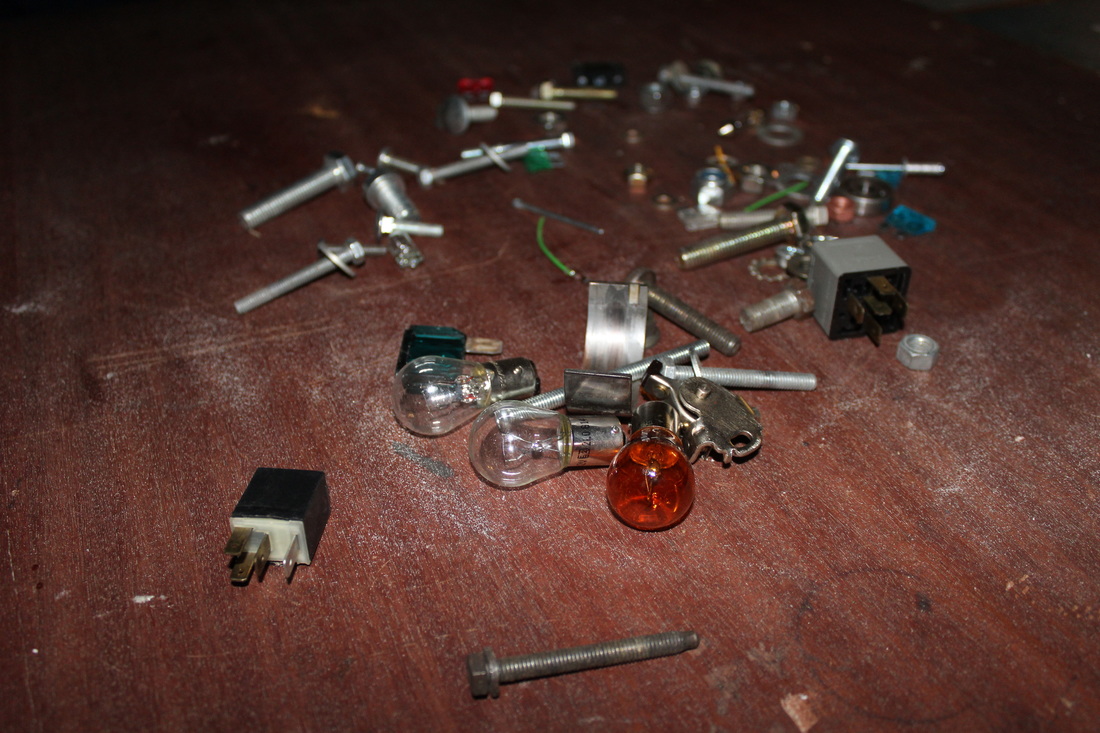
Annotation of Edit
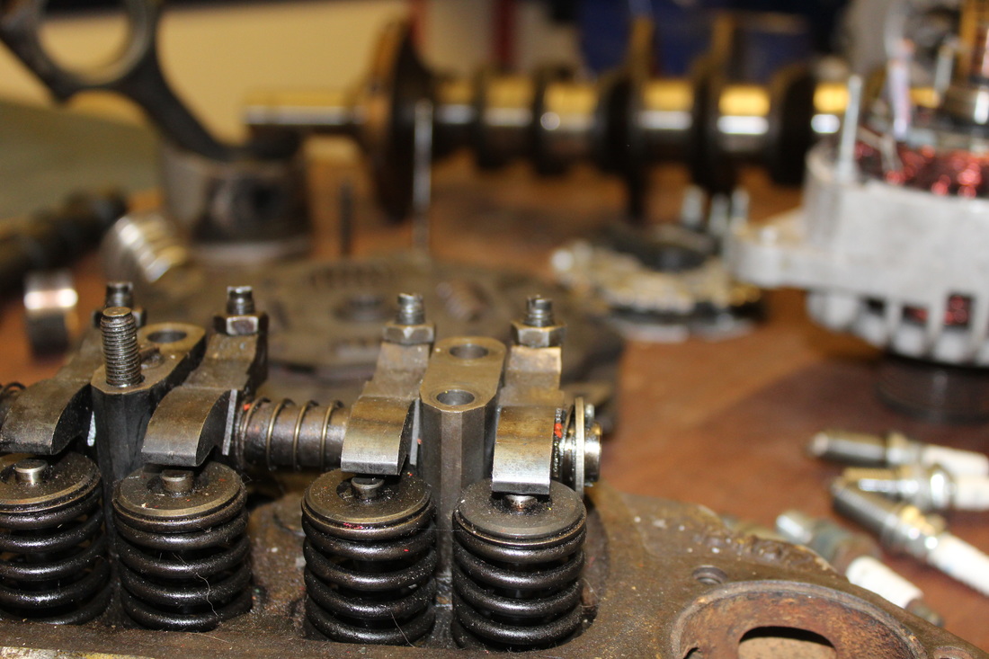
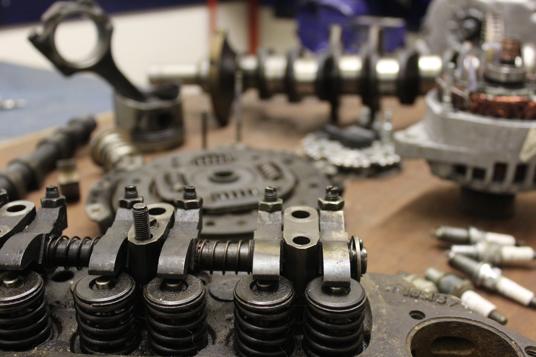
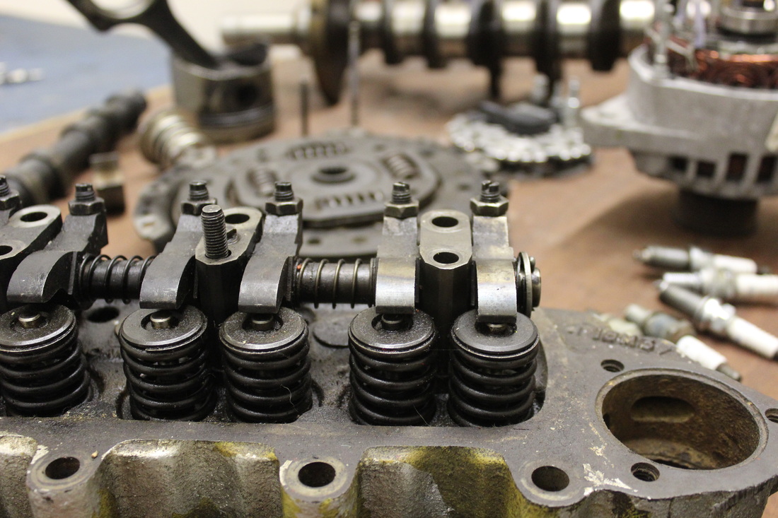
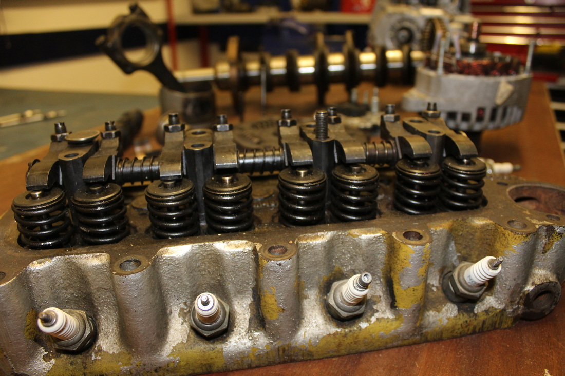
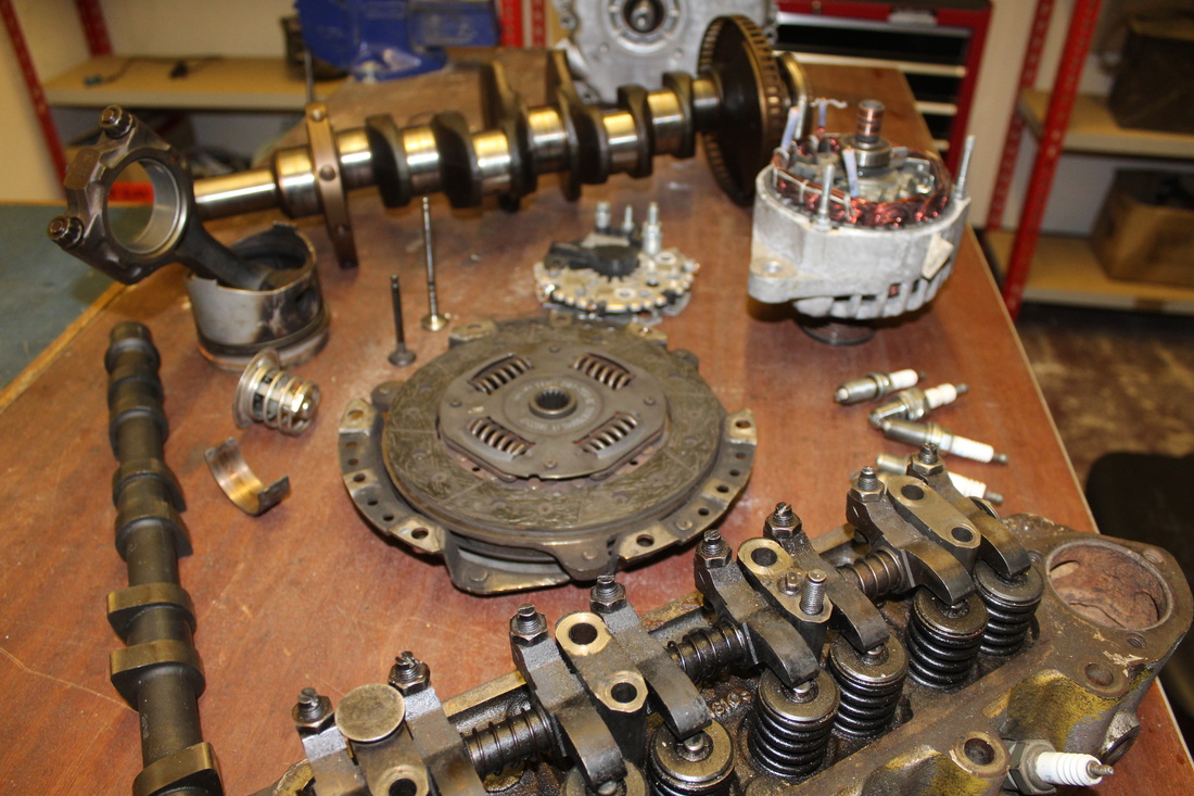
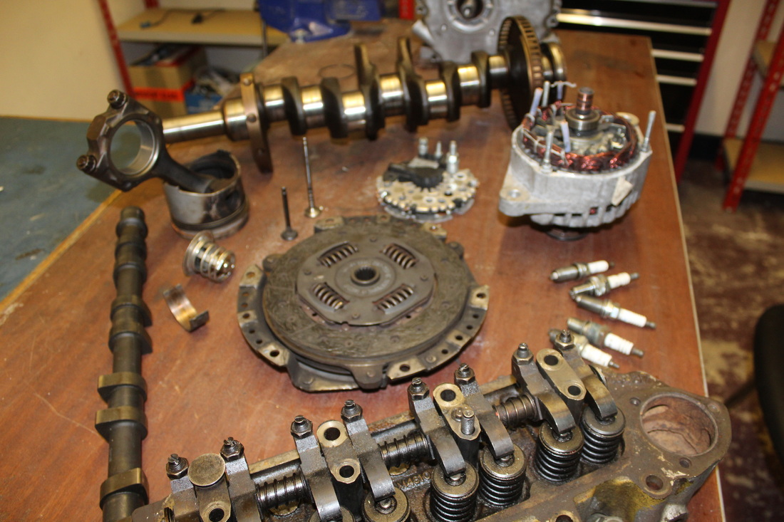
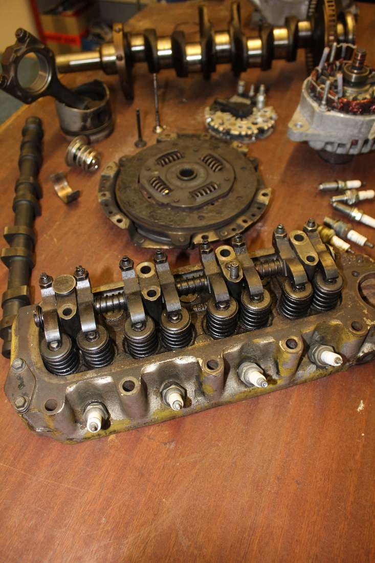
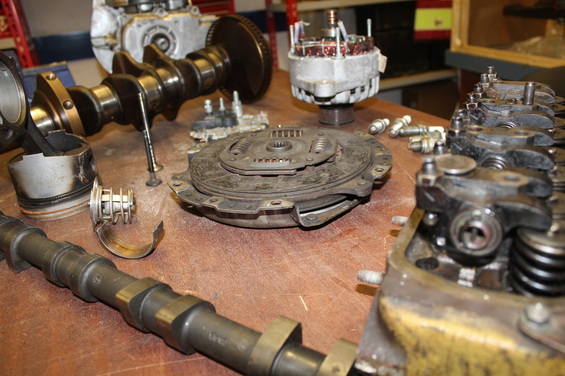
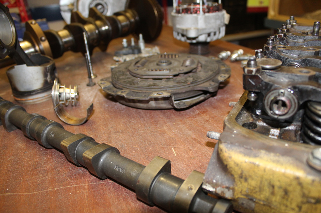
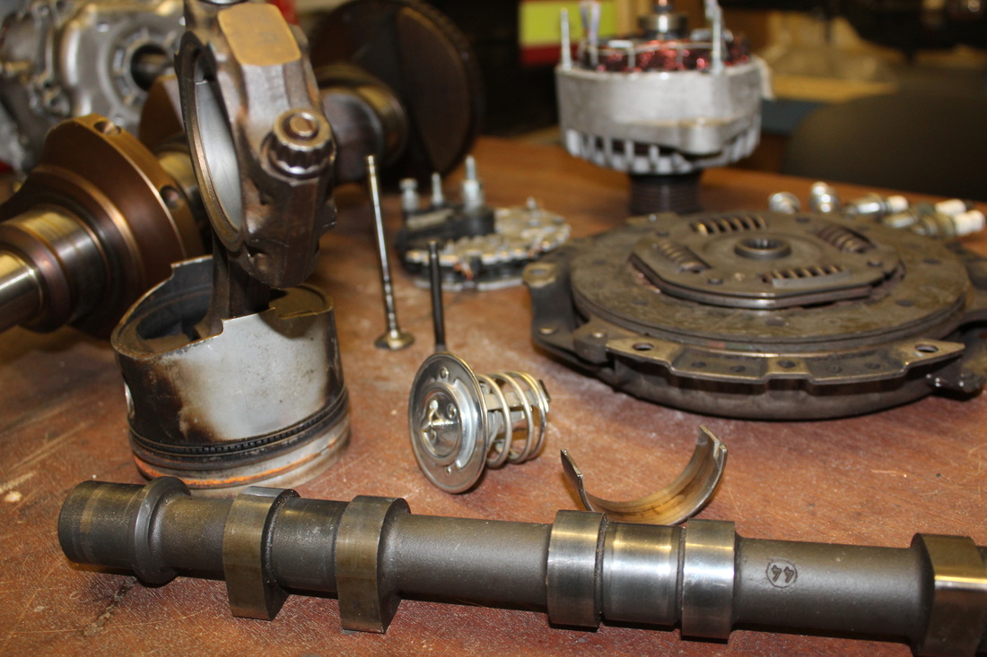
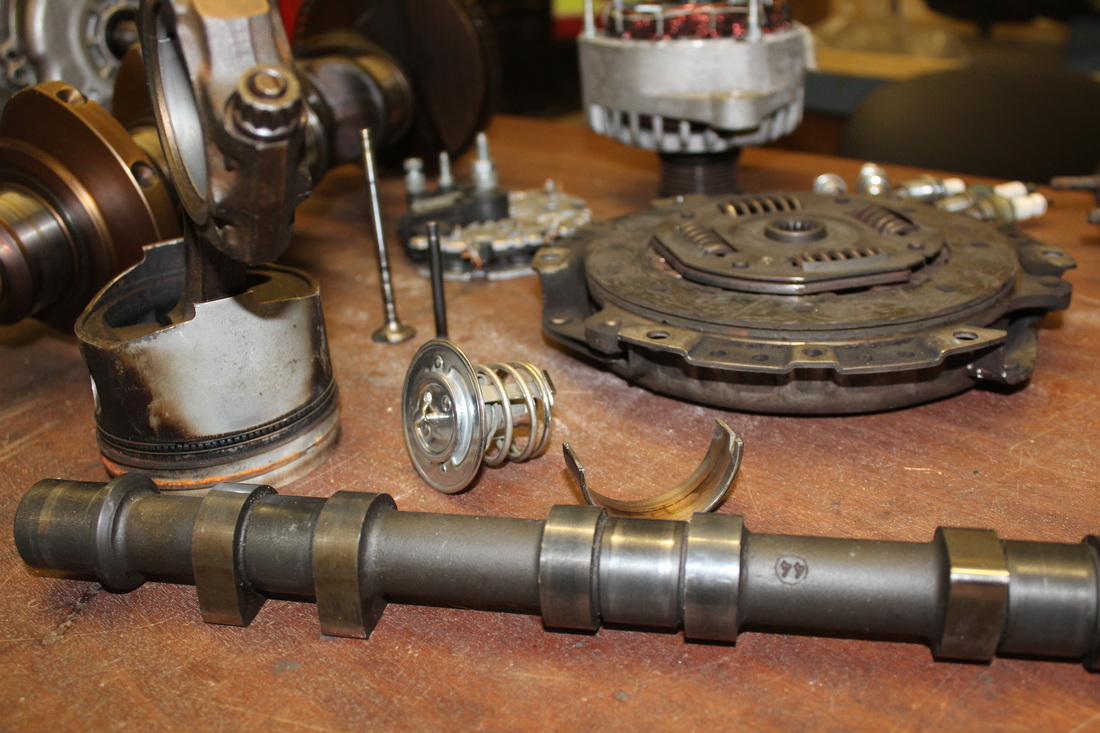
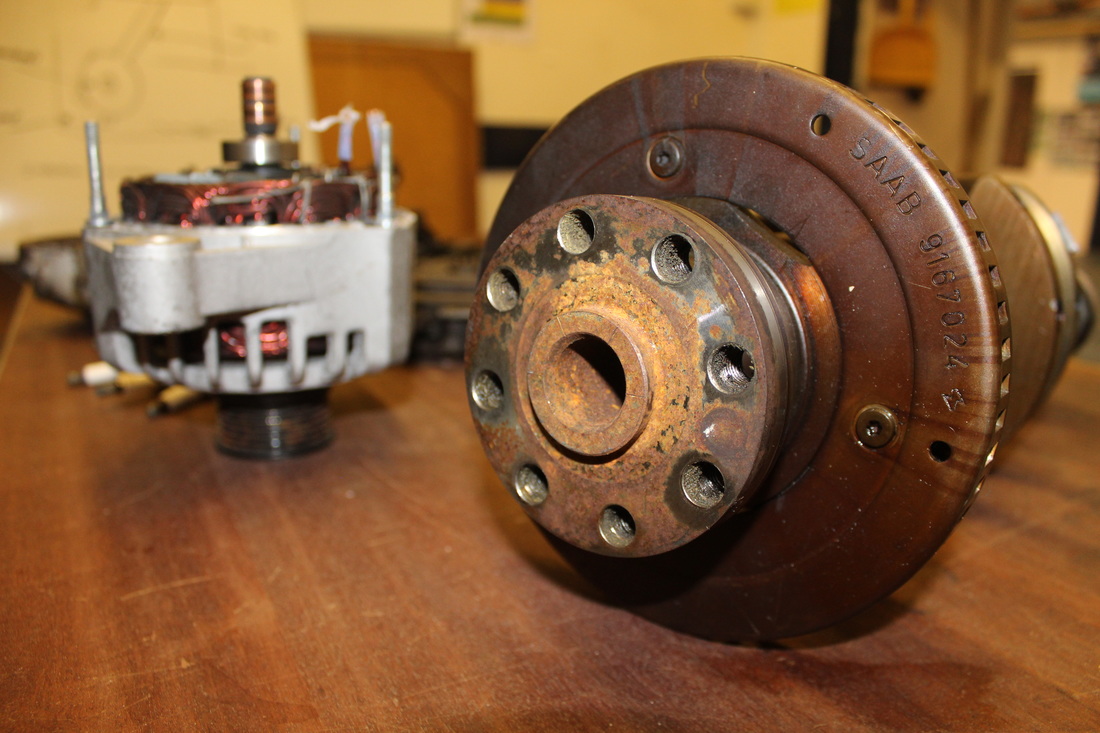
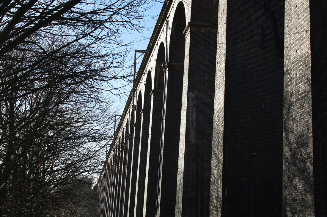
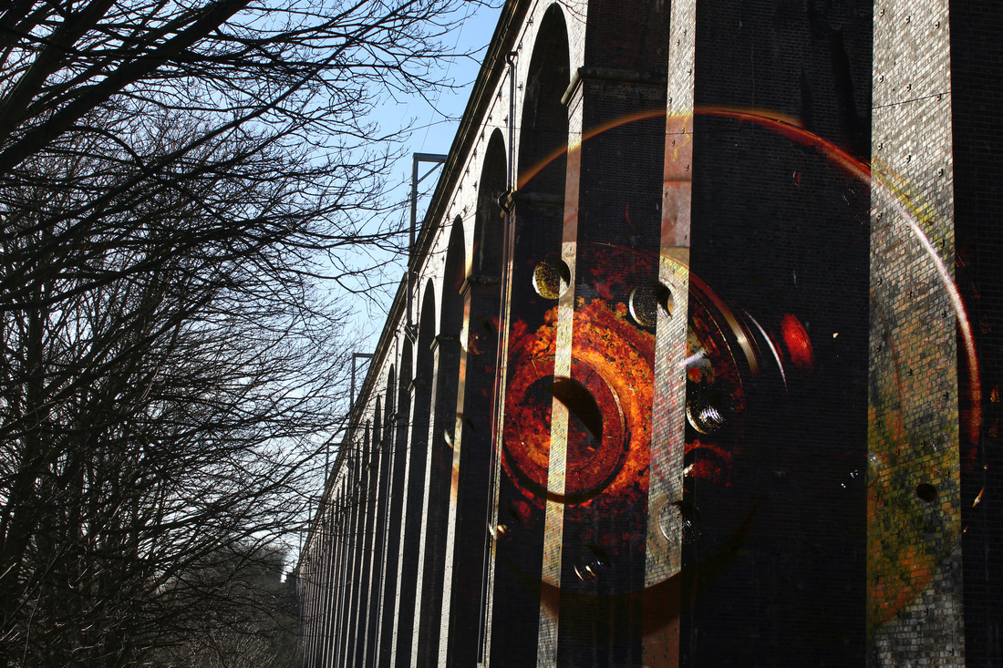
Within this photograph I was attempting to use previous photographs from other photo shoots to connect with the mechanical side of my investigation and how it relates with the topic of collections. When taking the picture of the bridge, I was using the style of repetition while with the mechanical piece I was trying to show how the collections of engineering can be seen in a wider range. However the type of camera I was using was a Canon 1200D with the settings of Landscape for the bridge and close up for the mechanical piece. These photographers were taken in the day time but the bridge was taken when it was sunny but making sure the sunlight was no in my frame but the crankshaft was taken using artificial light.
The work of Todd McLennan influenced me in completing this piece due to the way he sets out how the objects are set on the blank space. However he takes something that it is well known and turns it into something that can be clearly seen but in a different style of the way it is shaped. The tone and colour for the background was white and blank whereas I have used a bigger variety of colour to make my photography stand out on the page. With the bridge I was aiming for repetition but with the crankshaft I was trying to achieve the style of depth of field and how each piece stands out with a wooden table to balance it on. As I relate this to my own work I have put them together into Photoshop and made them seem as the way in which the bridge works and how it changes the impacts on people as well as how it was built. I thought about how these two relate to make a different message towards the image.
I feel that the composition is effective due to the fact that I used a image from a previous image and changed how it looked by using the mechanical piece which eventually creates a new meaning and message for it. Before I took these photographs I was thinking about repetition and depth of field but by putting these together I can use the clear sharpness of the crankshaft to paste onto the bridge to make a new way of how I as the photographer has thought into detail of how these two can relate. When putting the two images into Photoshop I was thinking about how I can add another message to the bridge relating to how it works and how it was built to become a Viaduct. The mechanical piece shows how as a whole, the bridge is part of a mechanical piece and how collections of bridges and mechanical pieces come together as a whole.
The contrast of tone and colour within this piece I used Photoshop to create a dark overlay texture which makes the mechanical piece darker and look more relatable to the message of how the bridge works and how it was build for the people living in Welwyn and the trains that run across the lines. These colours help create the message and how it responds to the audience which are viewing my work. The adjustments I made was cropping the image to only have the crankshaft in the frame and by overlaying this onto the bridge to create a clearer message of history.
In order to refine and develop this piece I would improve on how the setting of the bridge may need to become darker to relate to the mechanical piece and how it relates to history. However this shows the differences between time and when the bridge was designed and made in Welwyn. In my next photographs I will use the different textures and overlay other works to see how they can create a variety of messages.
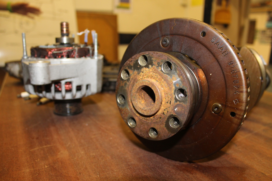
Annotation of Edit
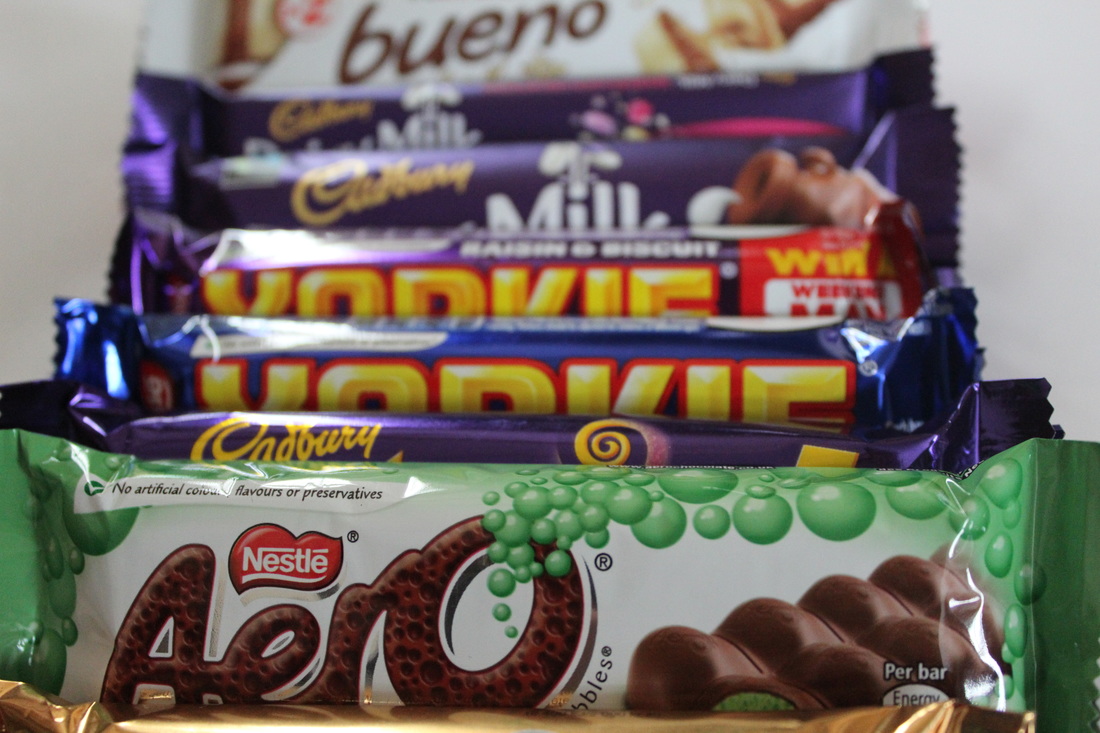
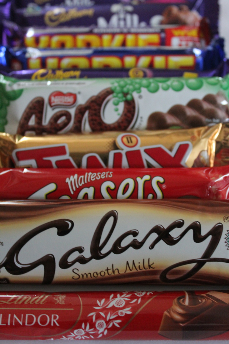
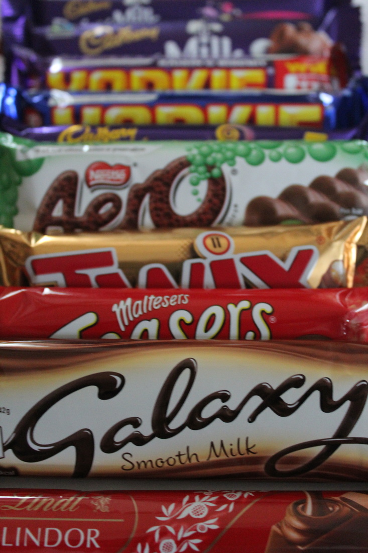
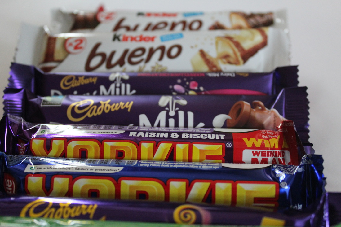
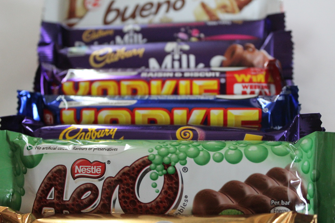
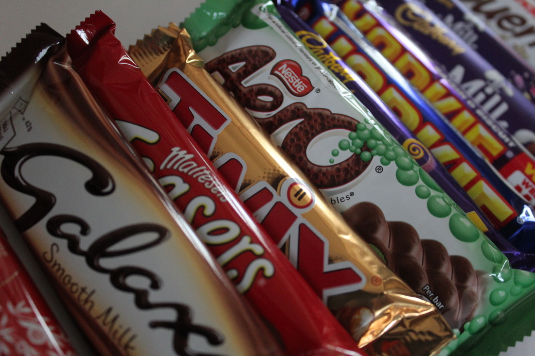
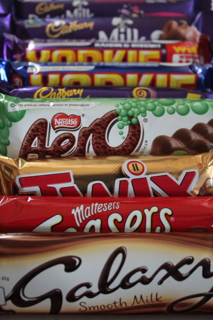
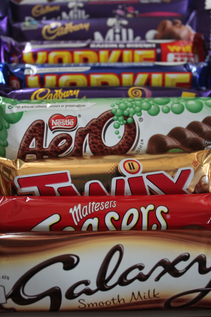
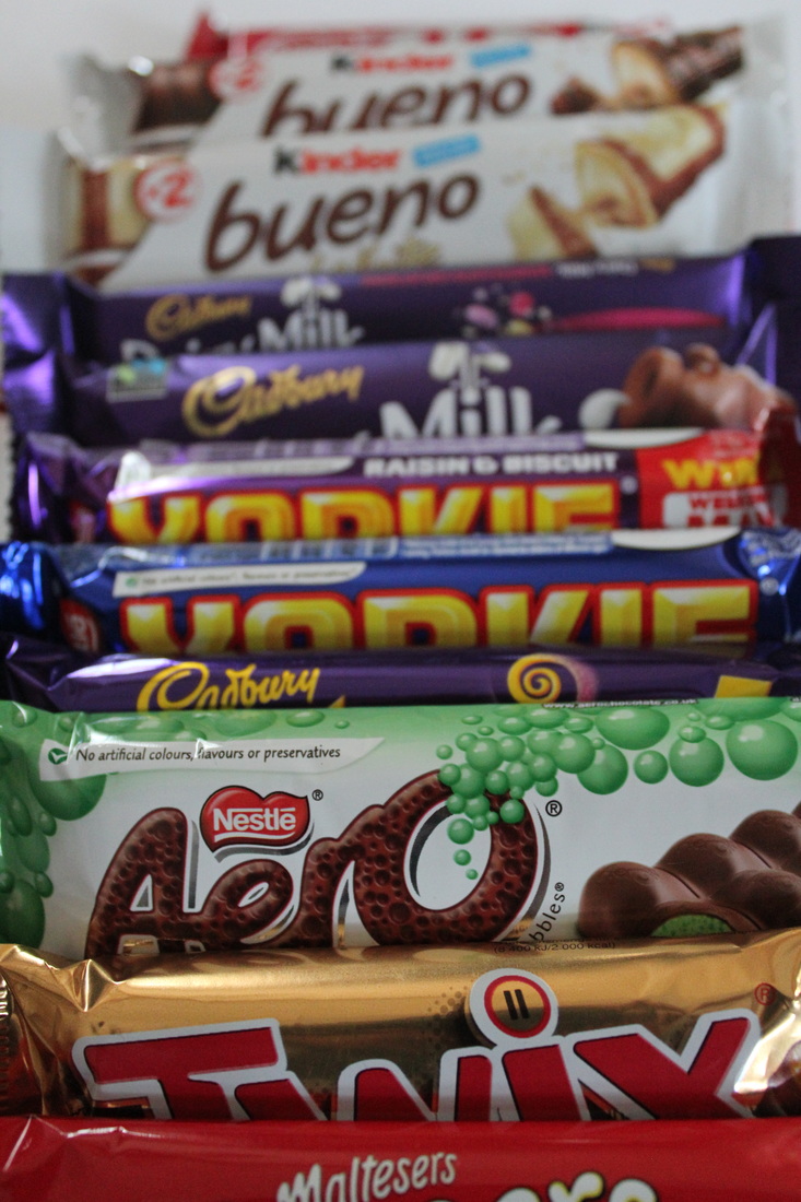
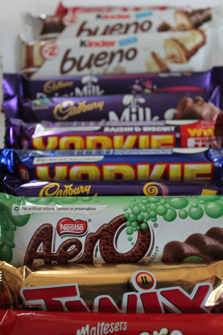
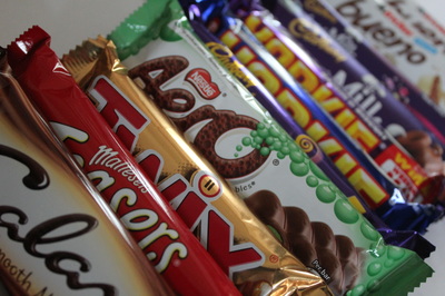
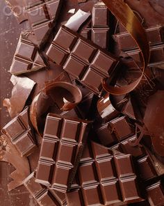
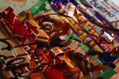
Within this photograph I was attempting to I was attempting to use close up as a skill and the setting on my camera to see if I can highlight the variety of colours on the packaging. As well as trying to group chocolate bars that break apart into separate pieces and this my own way of showing what I think of the topic of 'Things Come Apart'. The camera I used was a Canon 1200D and I have already mentioned that I used the close up setting. However I took this using artificial lighting but only as the chocolate bars because I used the chocolate melting as an image from the internet to help it create a different image in Photoshop. This was used by trying to relate back to old skills I have done in the past at the beginning of year 10.
The work of Todd McLennan influenced me in completing this piece due to the way he uses something that is well known and takes it apart but the audience or viewer of the images knows what the photographer is trying to demonstrate. The colour of the background is plain white (Todd McLennan's work) so I decided I would use that idea but it would be close up so the main tone on the page is the bright colours of the wrappers. His work was simple and it showed a clear message whereas I decided I would have a hidden meaning within my work but it still relates to the title of the Photo shoot and how it connects to the topic of collections. The techniques I used was depth of field so the chocolate bars further away were blurry but still recognizable and still show how these bars break apart into separate pieces.
I feel that the composition is effective due to the fact that I used an image from the internet that was a texture that demonstrated how chocolate breaks apart but it helps understand how I do not need to break into the packaging to see what the big thing that people love about chocolate. Before I took this photograph, I framed it in a way that keeps the chocolate bars as the center of the image but I kept the background of the white paper to relate it to how Todd McLennan presented his work. To adjust this image I put it into Photoshop to see how I can use previous skills to add another meaning to this image to show how I can connect it with the topic in my own personal way. However I took the original image and didn't not crop anything out but the chocolate had to be edited so that it can change the tone and still being able to tell what the chocolate bars are.
The contrast of tone and colour within this piece is highlighted by the variety of chocolate bars I have used and the way I changed the tone of the melting chocolate as I overlaid it. But making it still obvious to the viewer or audience what it is. The meaning it adds to the photograph is that you can tell how these chocolate bars relate to the title of 'Things Come Apart' and how these chocolate bars are different from other images I have taken.
In order to refine and develop this piece I would try and make it clearer for the audience or viewer to see what the chocolate bar is and how I have related it to the theme or topic or title. However I believe this is a good image as I have thought about the Photoshop in detail and how I wanted to interpret it in my own way by using the title 'Things Come Apart' .
