Repetition of objects
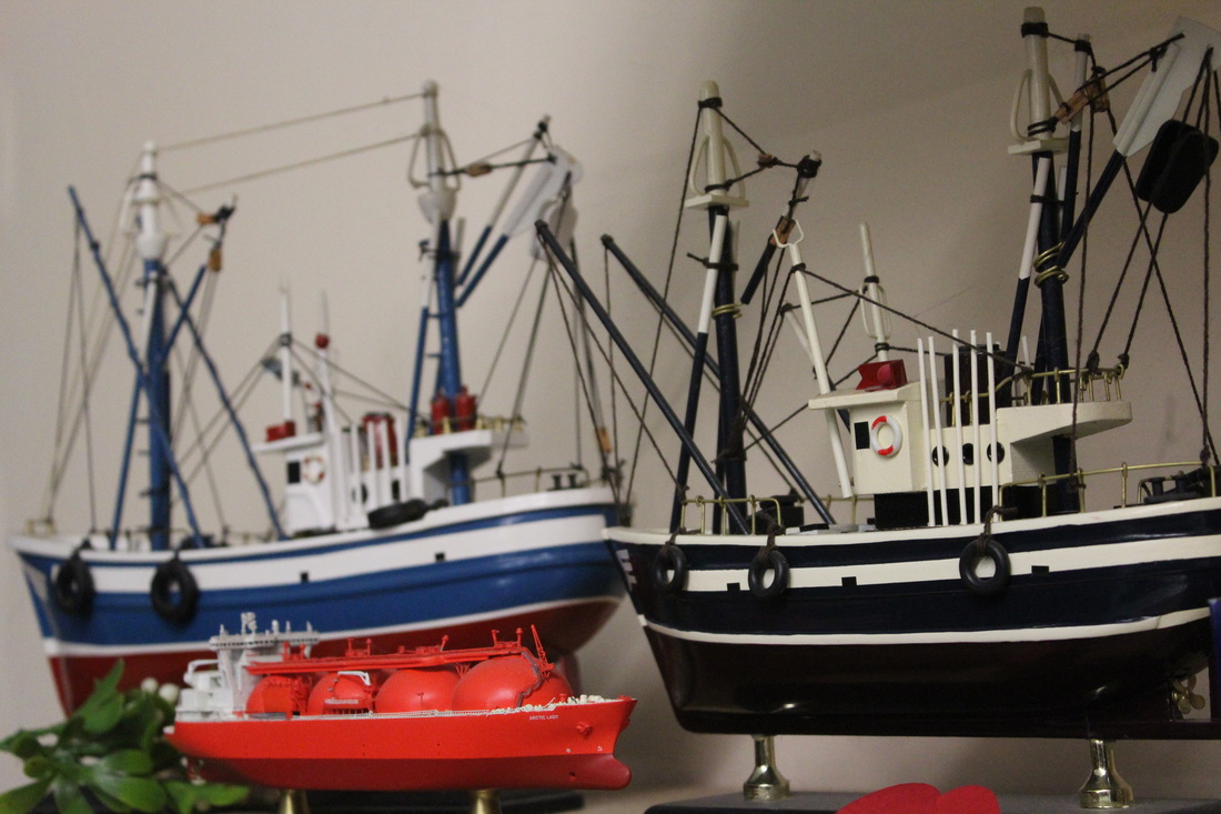
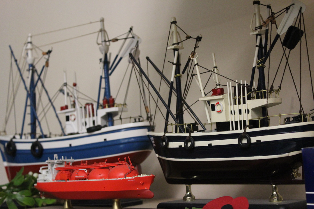
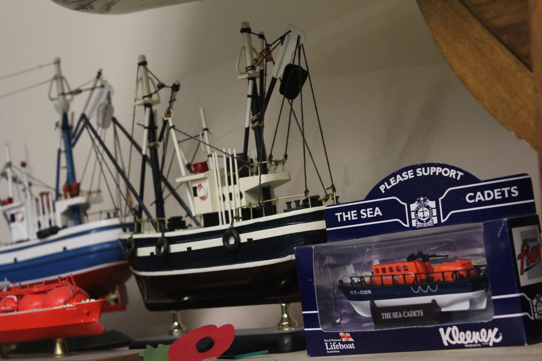
First photo shoot which I have completed


Edited Images
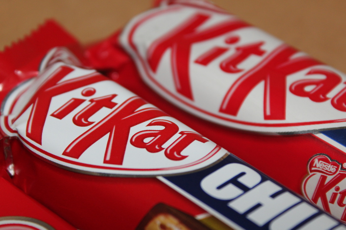
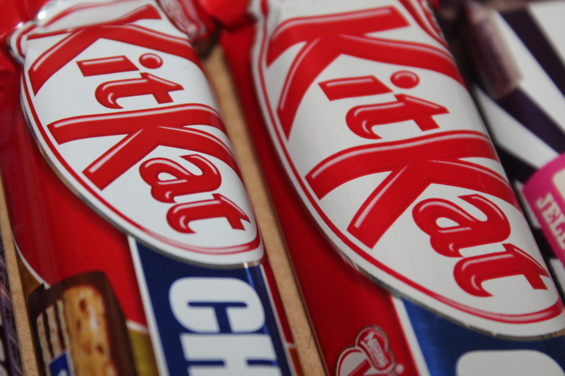
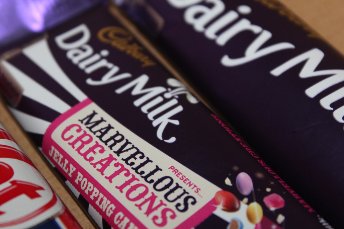
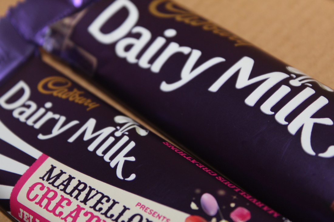
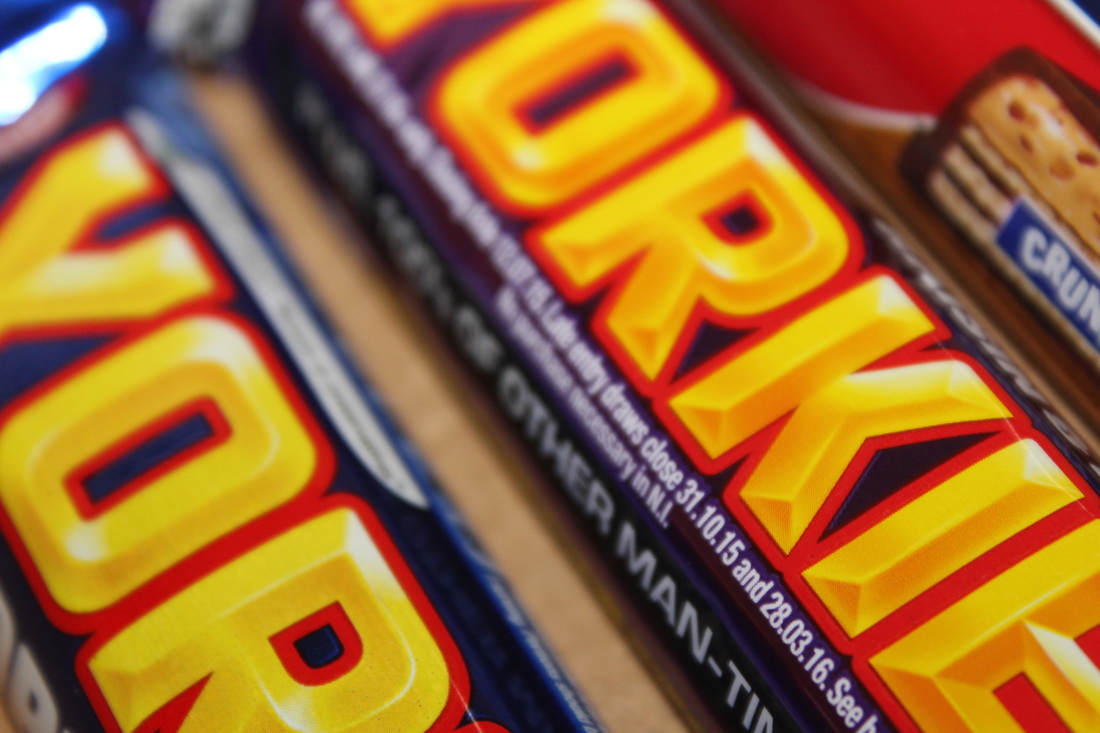
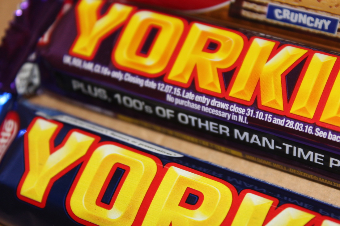
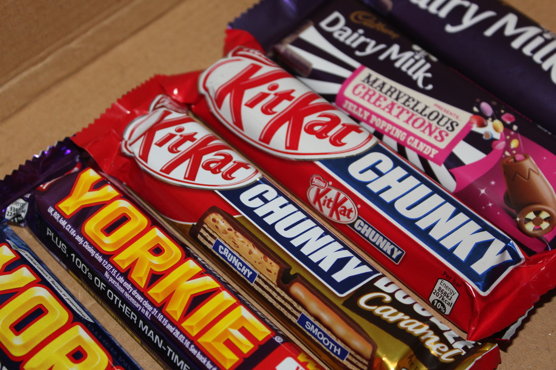
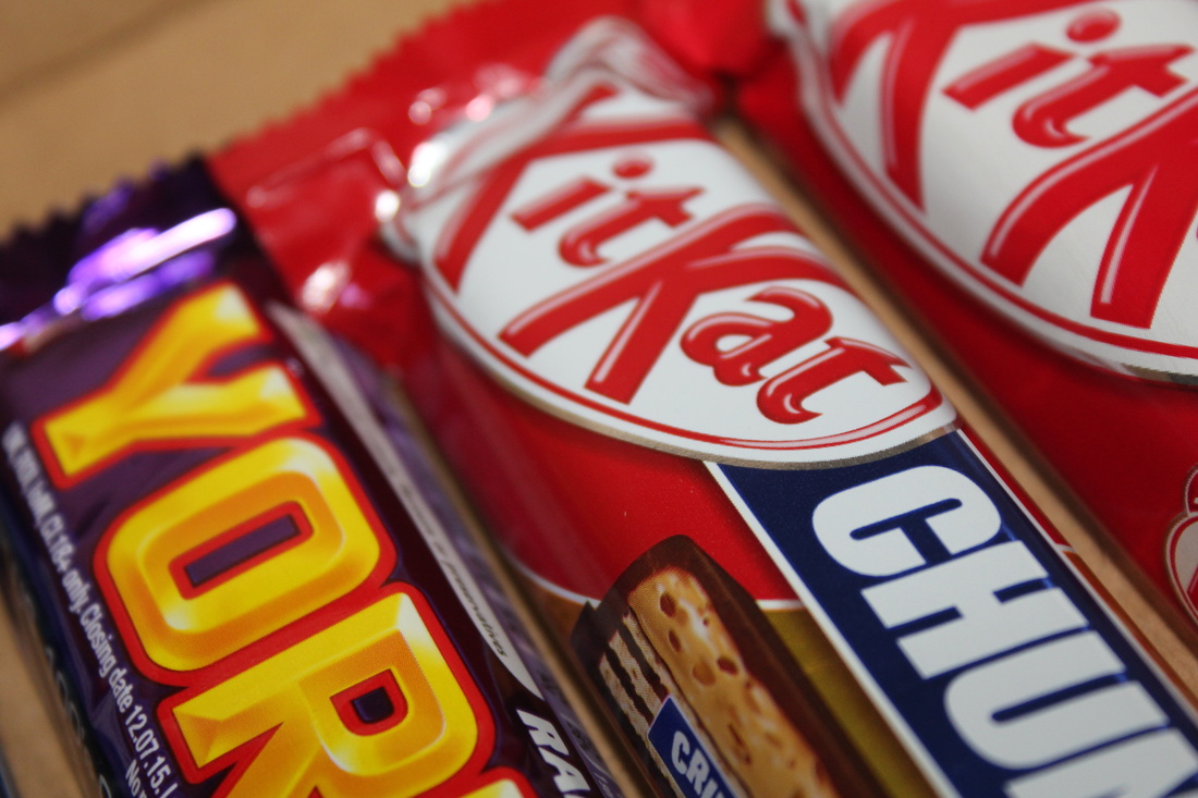
Final photo shoot - Chocolate bars
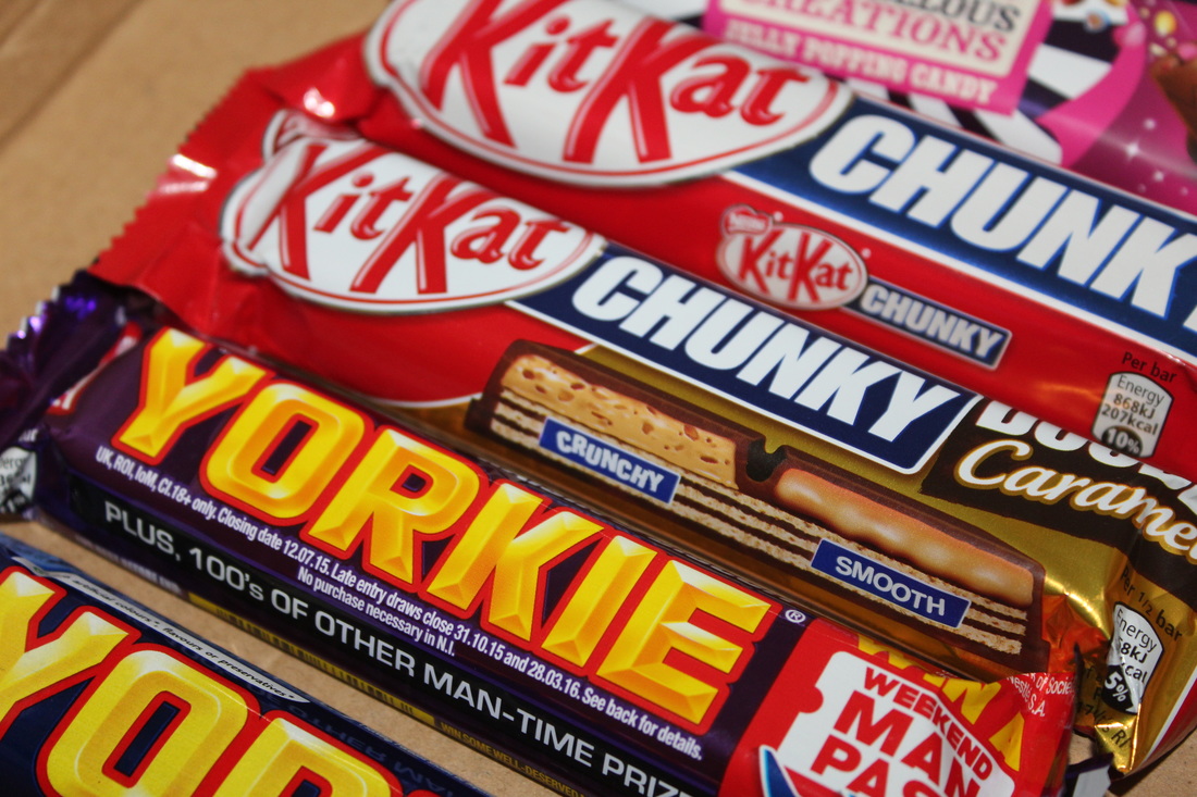


Contact Sheet
Edited Images


Annotation of Edit
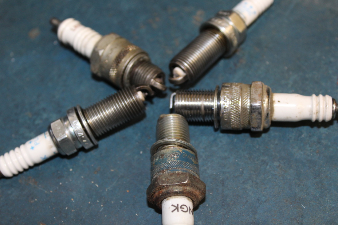
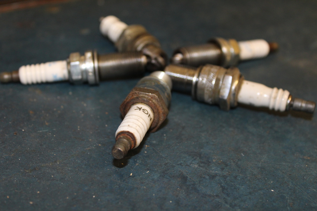
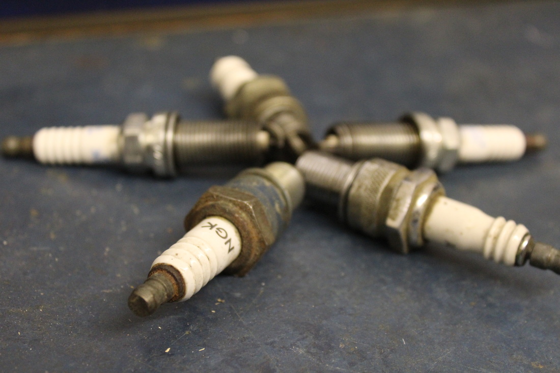
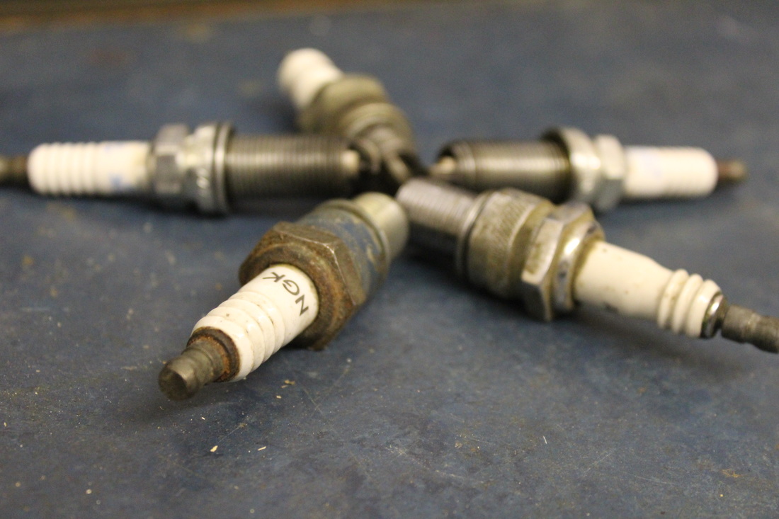
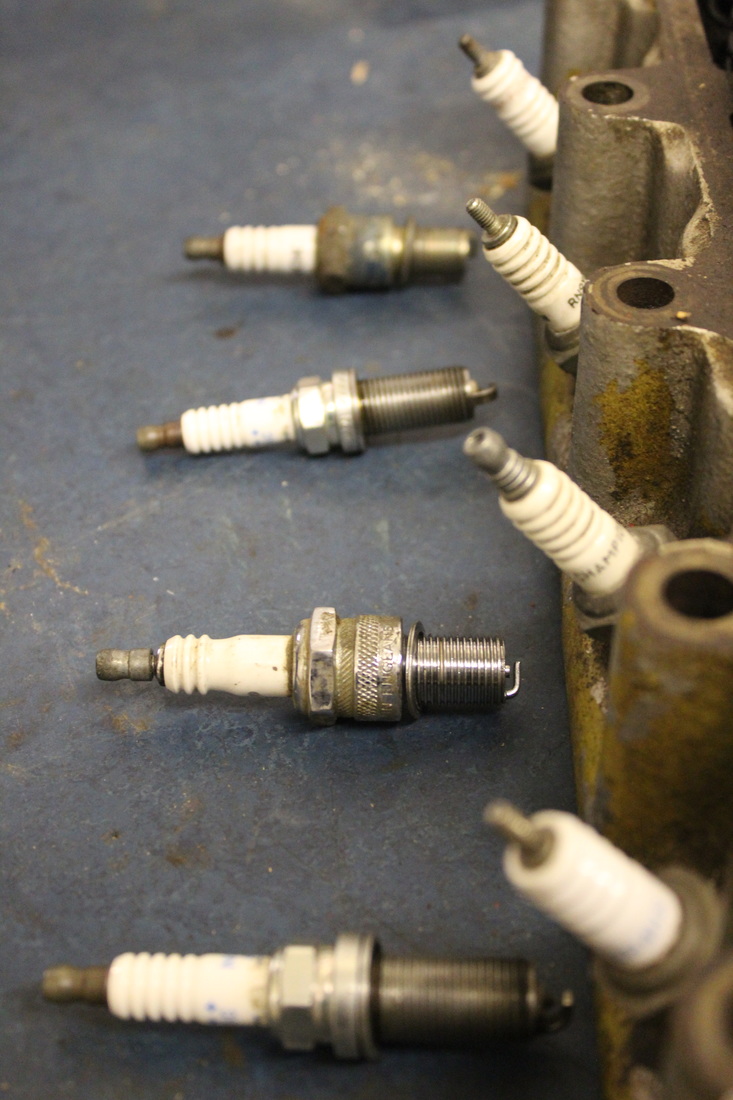
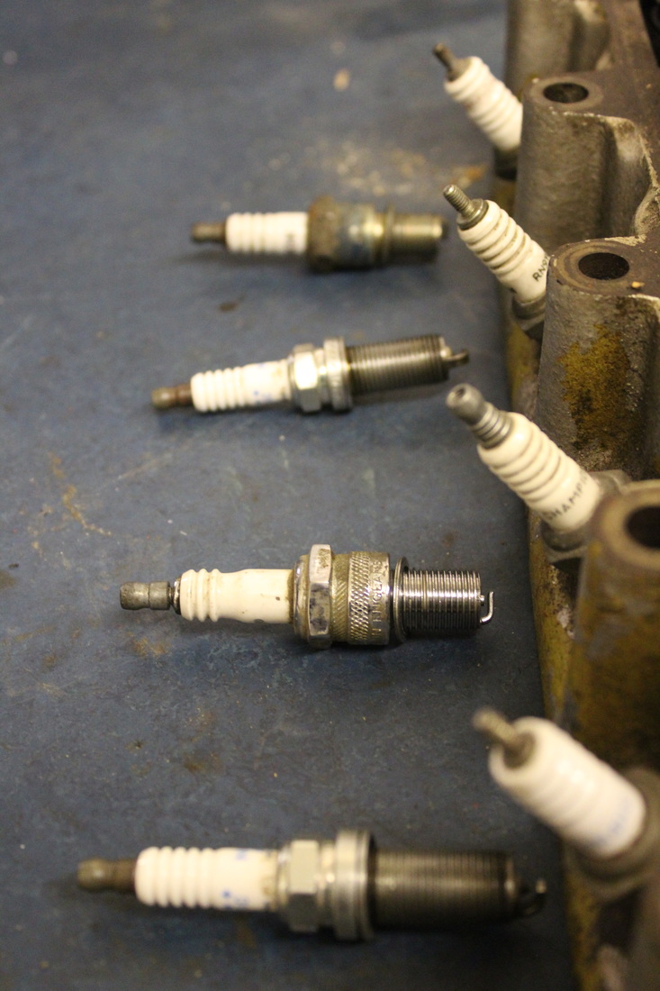
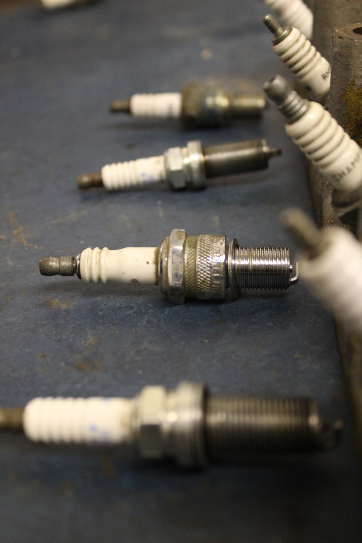
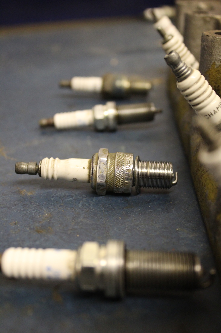
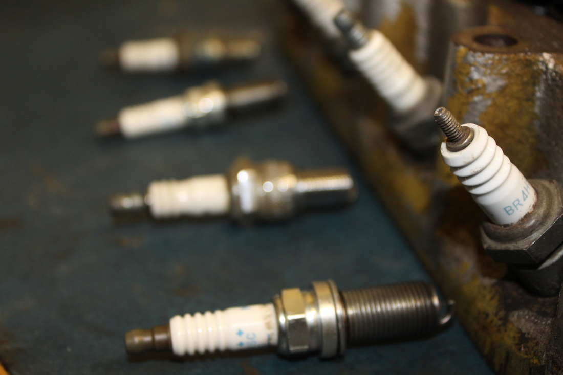
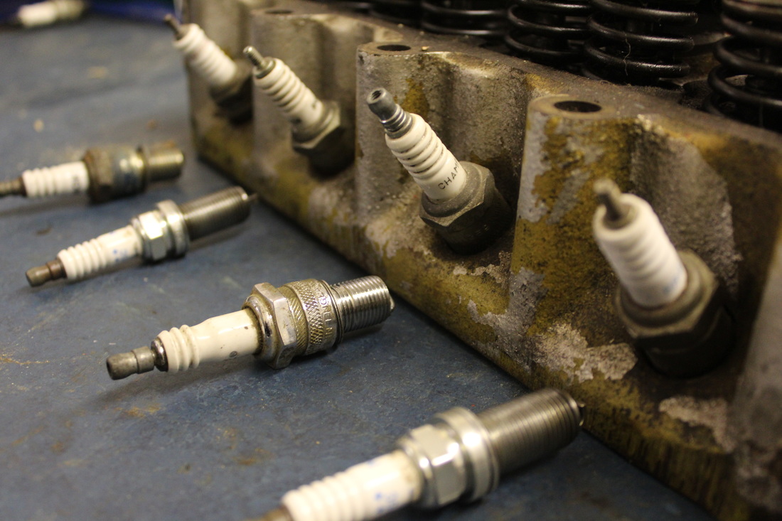
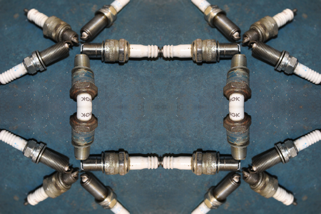
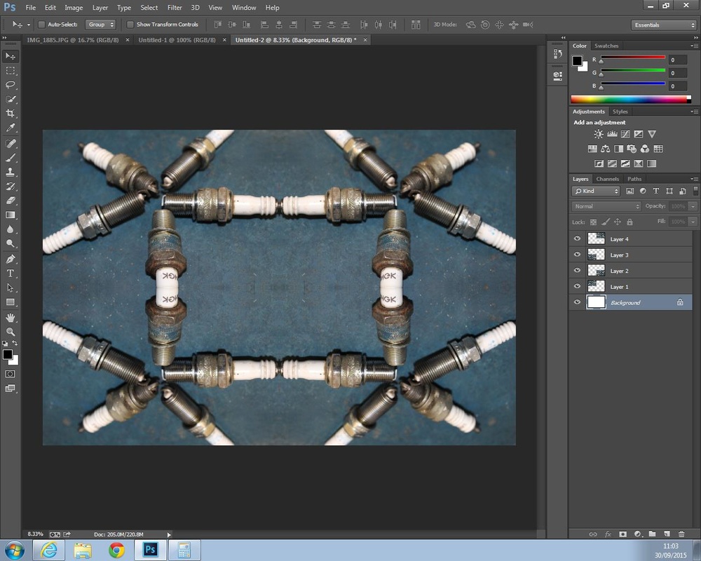
Within this photograph I was attempting to demonstrate that they all look the same from a distance but up close they all have different features and by using the setting of close-ups, I was able to present this. This photograph was taken by the Canon 1200d in the evening but in a dark closed room on the 1st of September. By using a dark room, I was able to show the texture and shape of the spark plugs using the flash from my camera and the artificial light of the room.
The work of Jillian Audrey influenced me in completing this piece due to the tone and the shapes which she has set out the objects in the photographs. She uses bright colours which varies depending on how she puts the objects together to present one whole image. In the photograph of buttons which is shaped like the United States, she uses the variety of coloured buttons to make the image stand out and make the country of the USA look clearer. The methods and techniques she has used is close-ups and texture or pattern of the buttons to show a clear picture of a country on a plain white background.
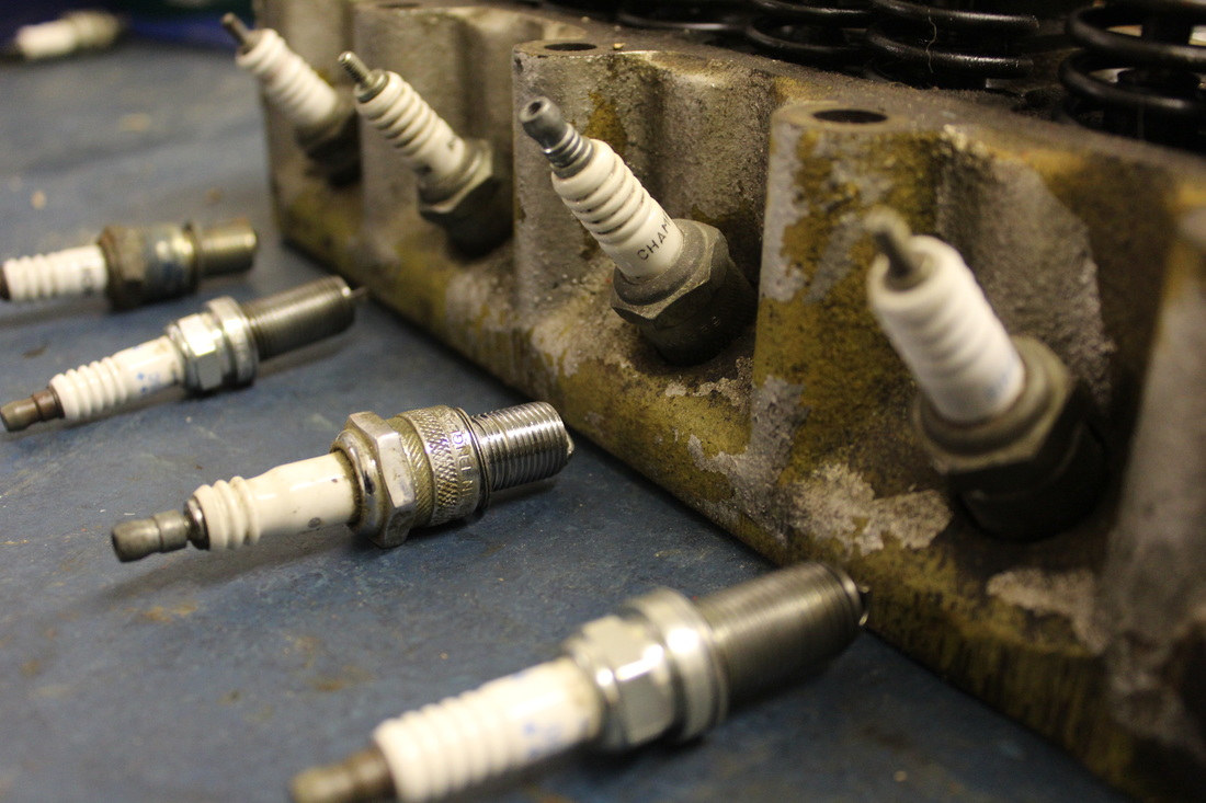
I feel that the composition is effective due to the fact that I used the pattern in which the spark plugs were presented to create an effective pattern which could be repeated using Photoshop. When taking this photograph, I took it to show how they were all different even though they all do the same job. However when putting this photo into Photoshop, I placed them next to each other but making sure they all connected to create one whole pattern without any gaps. When editing, I cropped out the excess background (blue table) so when I linked copying images together, they would be able to connect easily.
The contrast of colour within the piece was dark but the white from the spark plugs made it stand out on the page compared to the blue table and with the repetition of spark plugs, it helps it link together to form different shapes which could be seen in a variety of ways depending on how the audience sees it. The mood or emotion of this image is seen as an illusion where you can see the order of the plugs and how they are symmetrical to each other creative a perfect rectangle which then leads of to something else. Through Photoshop I have been able to create this but from the raw original image, it presented a small but clear shape of a star which shows all the features of the mechanical pieces.
In order to refine and develop this piece I would make this piece bigger to show a larger optical illusion which may demonstrate a picture to the audience and they can see how I have related it to the topic of Collections. In my other photographs I will try to add more colour to the edits and see how it changes the mood of the audience and the photograph itself.
The work of Jillian Audrey influenced me in completing this piece due to the tone and the shapes which she has set out the objects in the photographs. She uses bright colours which varies depending on how she puts the objects together to present one whole image. In the photograph of buttons which is shaped like the United States, she uses the variety of coloured buttons to make the image stand out and make the country of the USA look clearer. The methods and techniques she has used is close-ups and texture or pattern of the buttons to show a clear picture of a country on a plain white background.
I feel that the composition is effective due to the fact that I used the pattern in which the spark plugs were presented to create an effective pattern which could be repeated using Photoshop. When taking this photograph, I took it to show how they were all different even though they all do the same job. However when putting this photo into Photoshop, I placed them next to each other but making sure they all connected to create one whole pattern without any gaps. When editing, I cropped out the excess background (blue table) so when I linked copying images together, they would be able to connect easily.
The contrast of colour within the piece was dark but the white from the spark plugs made it stand out on the page compared to the blue table and with the repetition of spark plugs, it helps it link together to form different shapes which could be seen in a variety of ways depending on how the audience sees it. The mood or emotion of this image is seen as an illusion where you can see the order of the plugs and how they are symmetrical to each other creative a perfect rectangle which then leads of to something else. Through Photoshop I have been able to create this but from the raw original image, it presented a small but clear shape of a star which shows all the features of the mechanical pieces.
In order to refine and develop this piece I would make this piece bigger to show a larger optical illusion which may demonstrate a picture to the audience and they can see how I have related it to the topic of Collections. In my other photographs I will try to add more colour to the edits and see how it changes the mood of the audience and the photograph itself.

Annotation of Edit
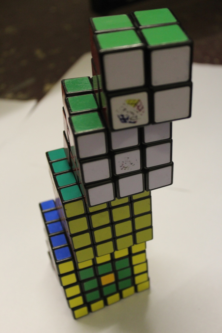
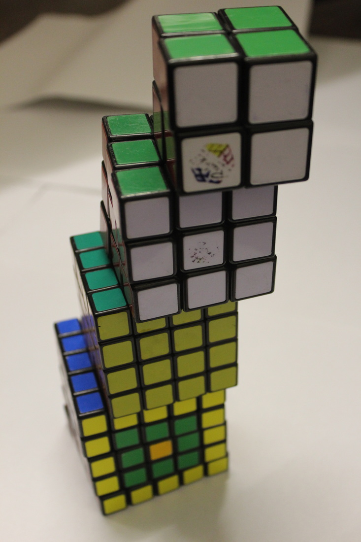
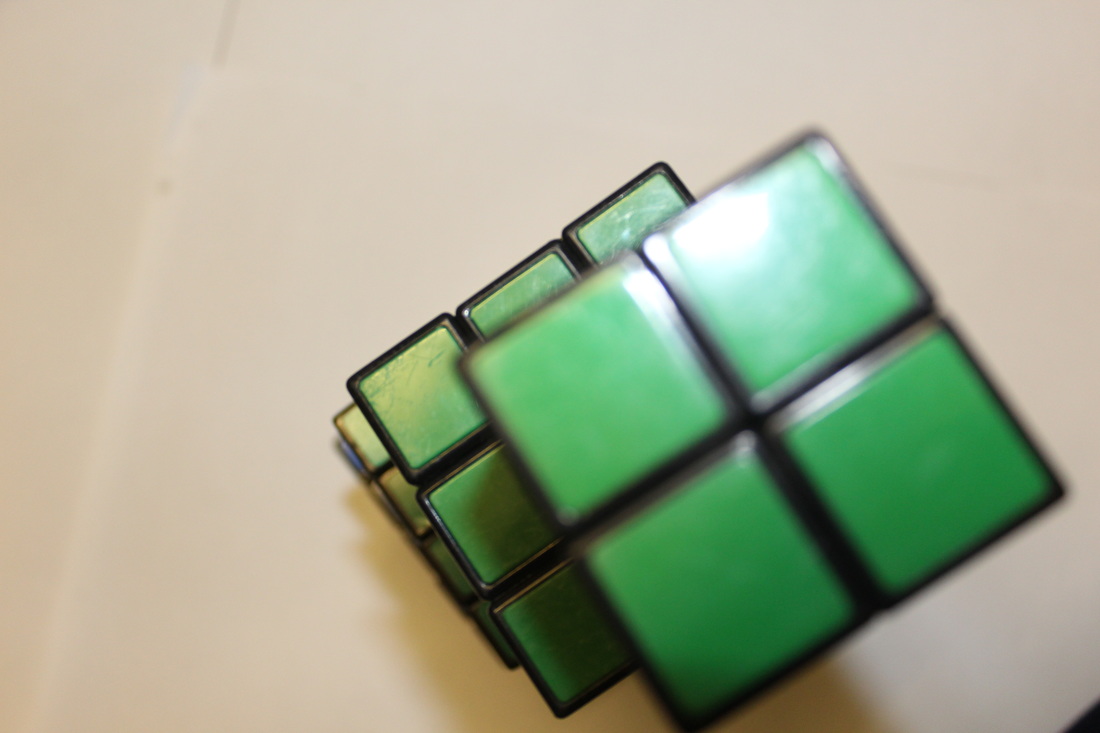
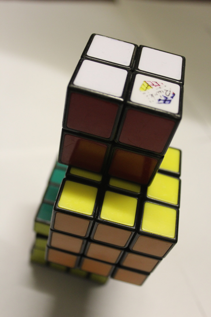
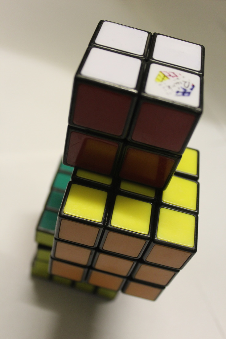
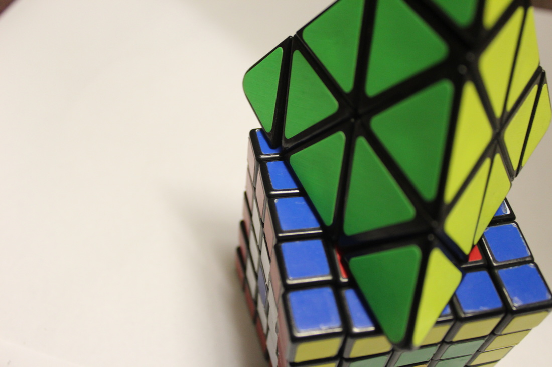
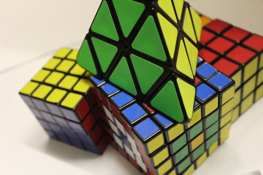
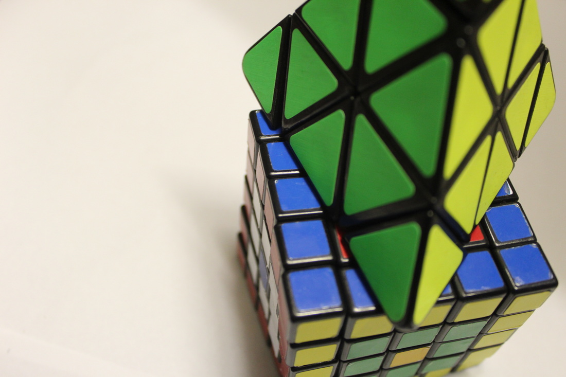
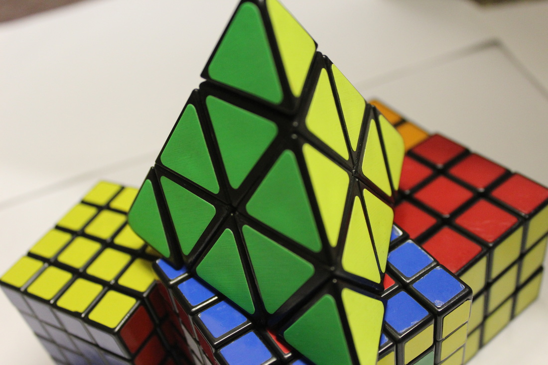
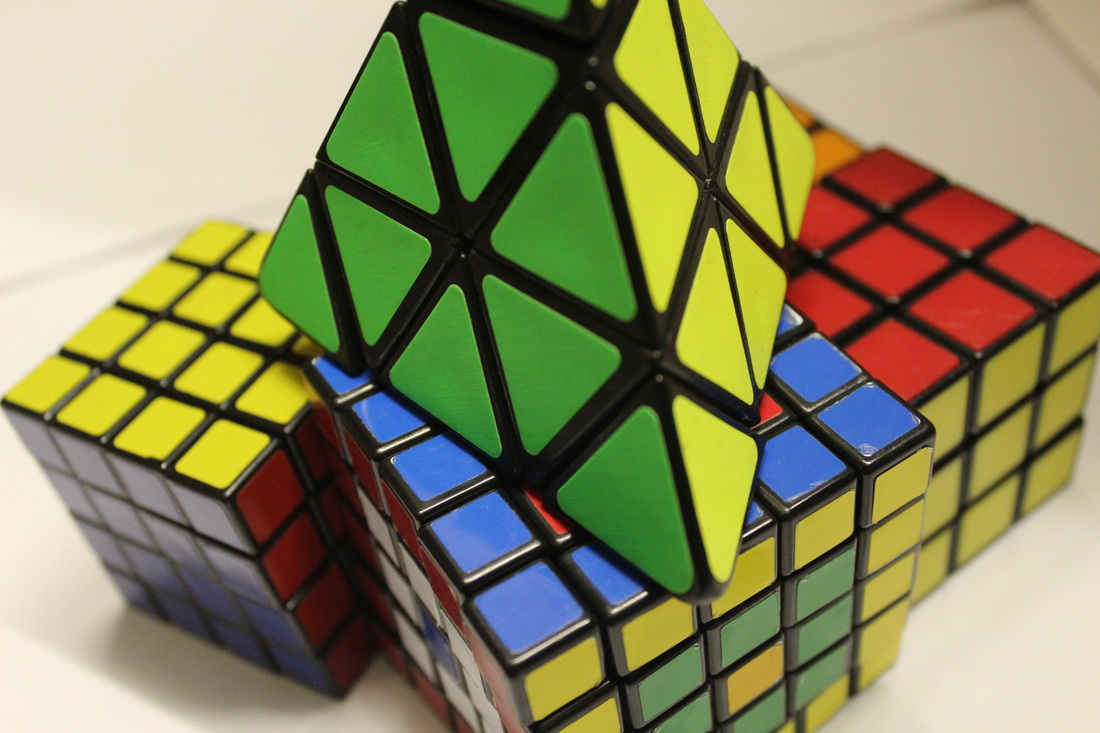
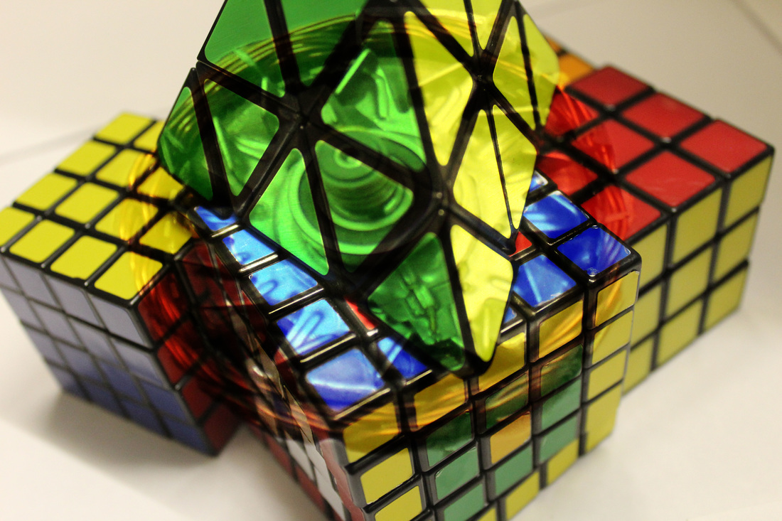
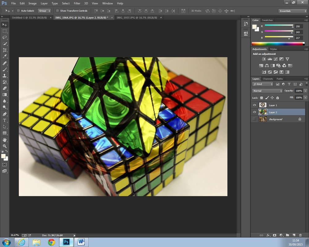
Within these photographs I was attempting to show the bright colours of the Rubik's cubes and the mechanical pieces which are placed together in one place. This was created using a Canon 1200d in a room which was lit up using artificial light but it brought out the bright colours of the Rubik's cube and how all of the objects are placed together. This photo shoot was taken on the 1st of September in the evening so when the room was dark and no light was erupting into the room.
The work of Jillian Audrey influenced me in completing this piece due to the way she put different things together to create one image which demonstrates a whole image. She just takes a variety of images and places them together (such as Deck the Doors) to create one image with the same meaning. To put the Rubik's cube and the mechanical parts together I can create an mage which is based on how people think and what it takes to create a perfect Rubik's cube.
By taking these two different images into Photoshop, I was able to create an image which uses the bright colours (tone) and the mechanical pieces (texture) which could become one image. Once these two were over layed I was able to present an image which could be seen as the moving parts of a Rubik's cube or how a person thinks when they are moving and thinking about the challenge in front of them.
The contrast of tone and colour within this piece can be seen by brightening the Rubik's cube colour and when placing the mechanical parts into it, it gives it a different tone to the photograph. The mood of this edit is bright but it makes the audience think about why the photographer (myself) has put these two images together and what I saw.
In order to refine and develop my work, I will see if I can try to make my images look brighter and more colourful than the original image so I could over lap it in with another photograph so that it could link into each other. By doing this it will get the audience to think and maybe link it into what collections means as a topic.


Annotation of Edit
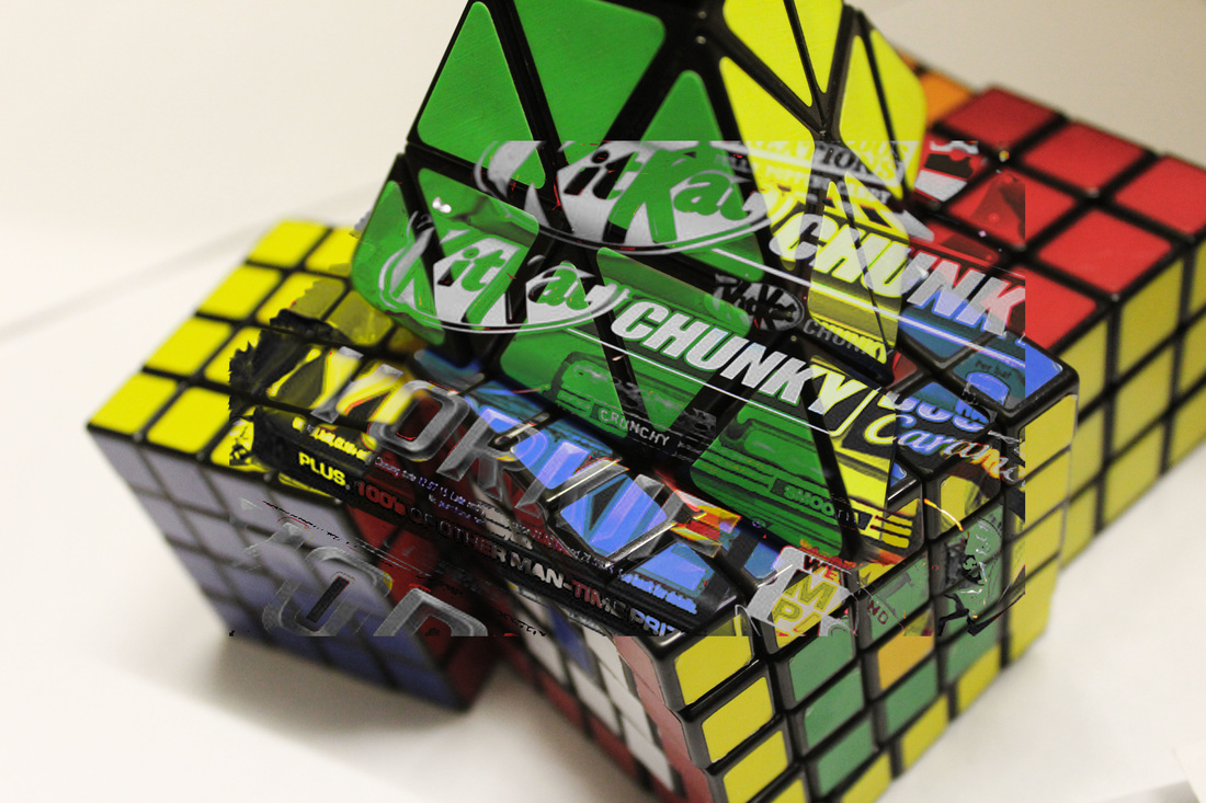
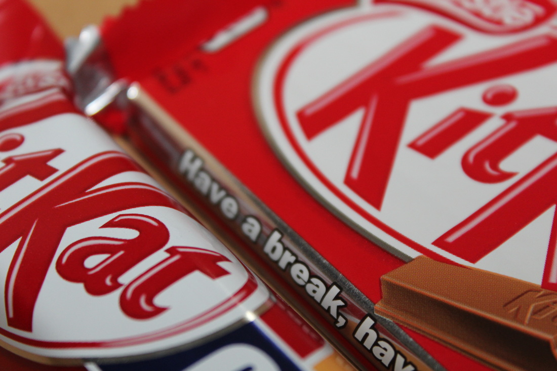
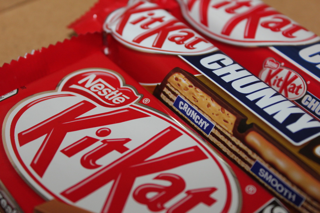
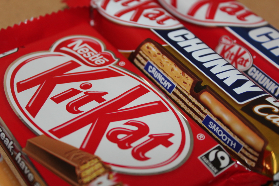
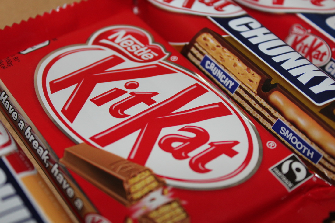
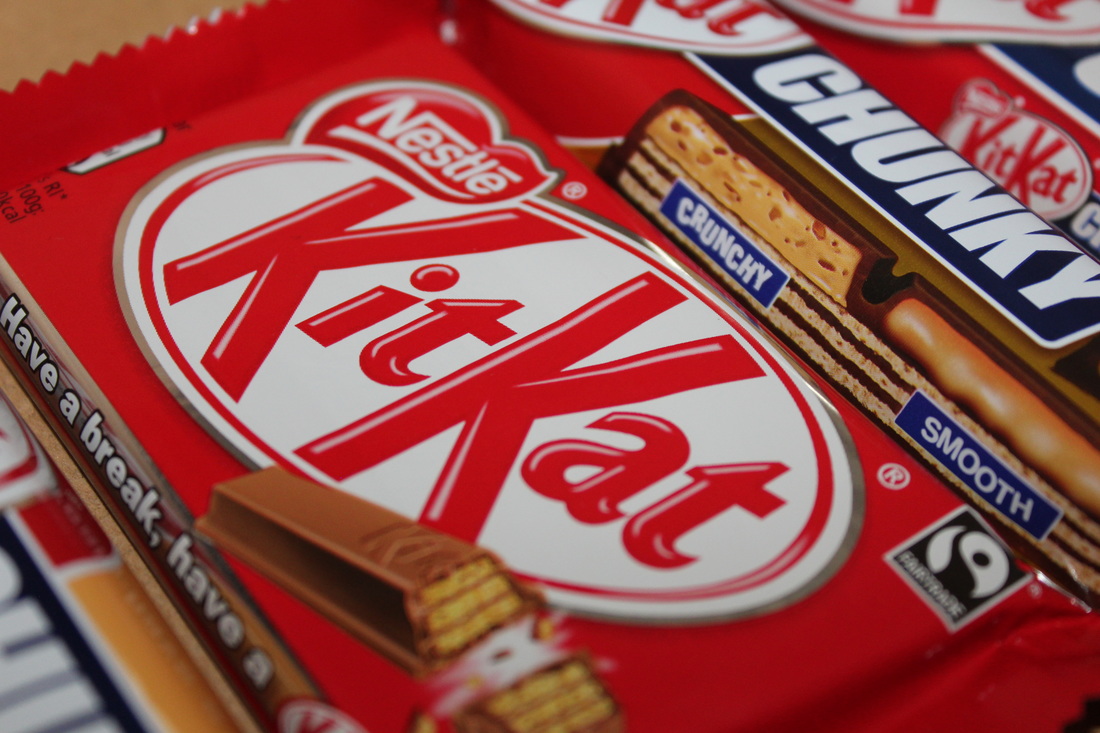
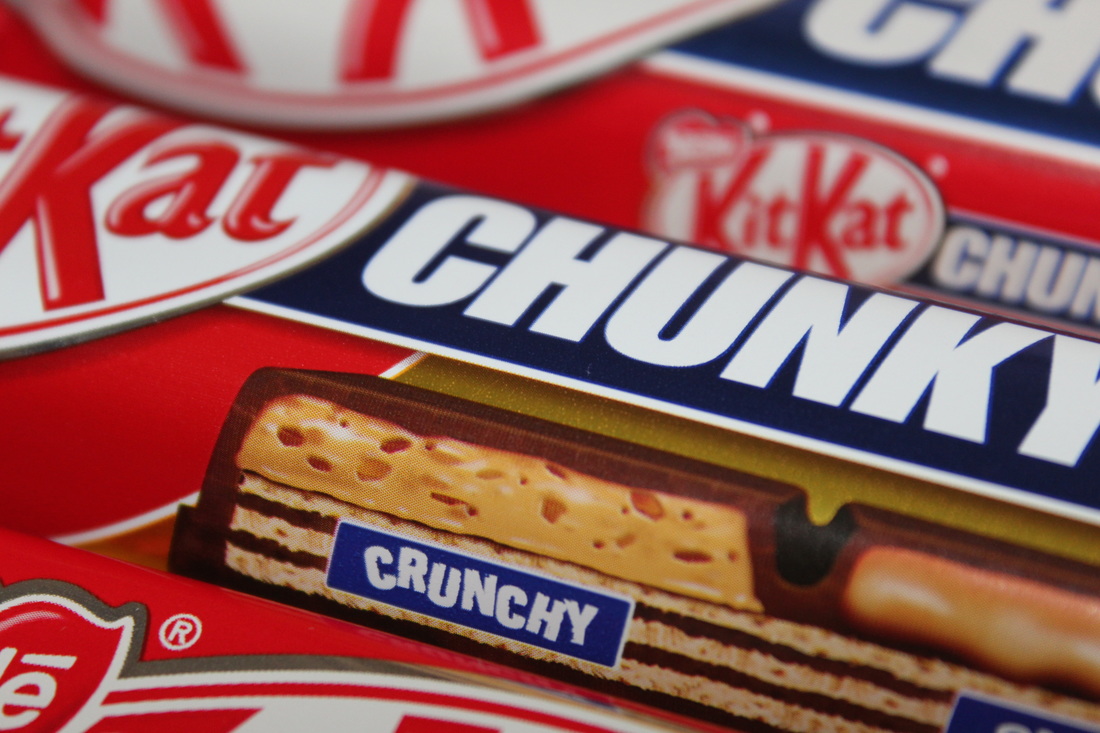
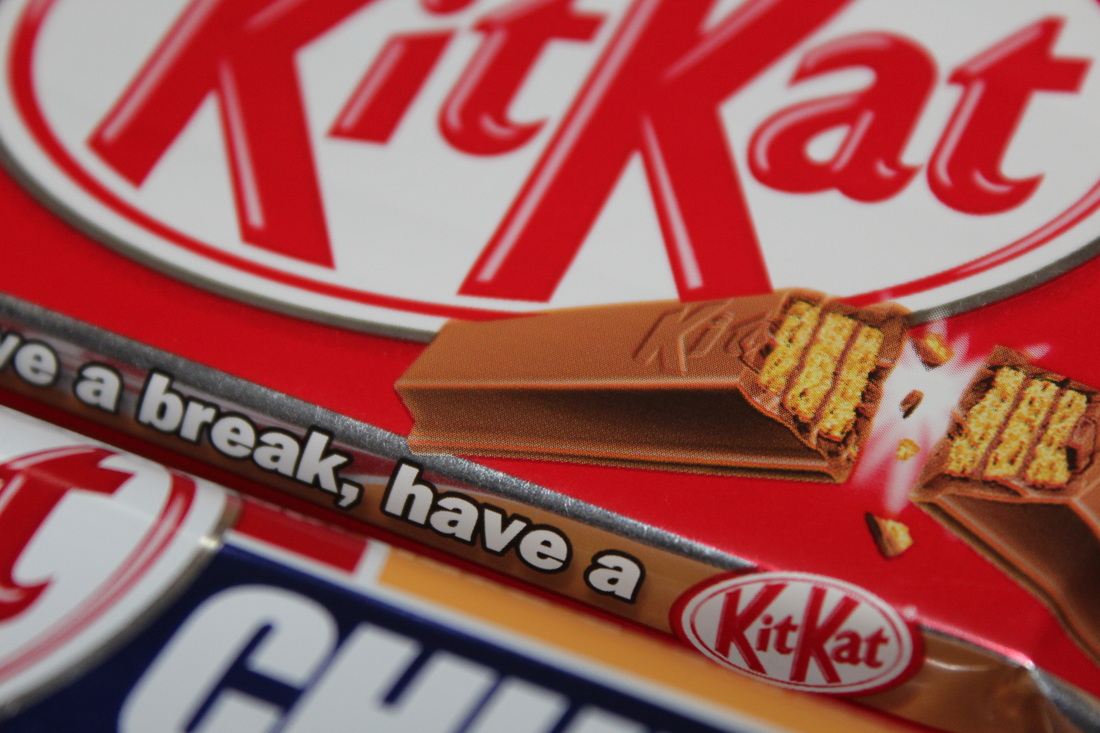
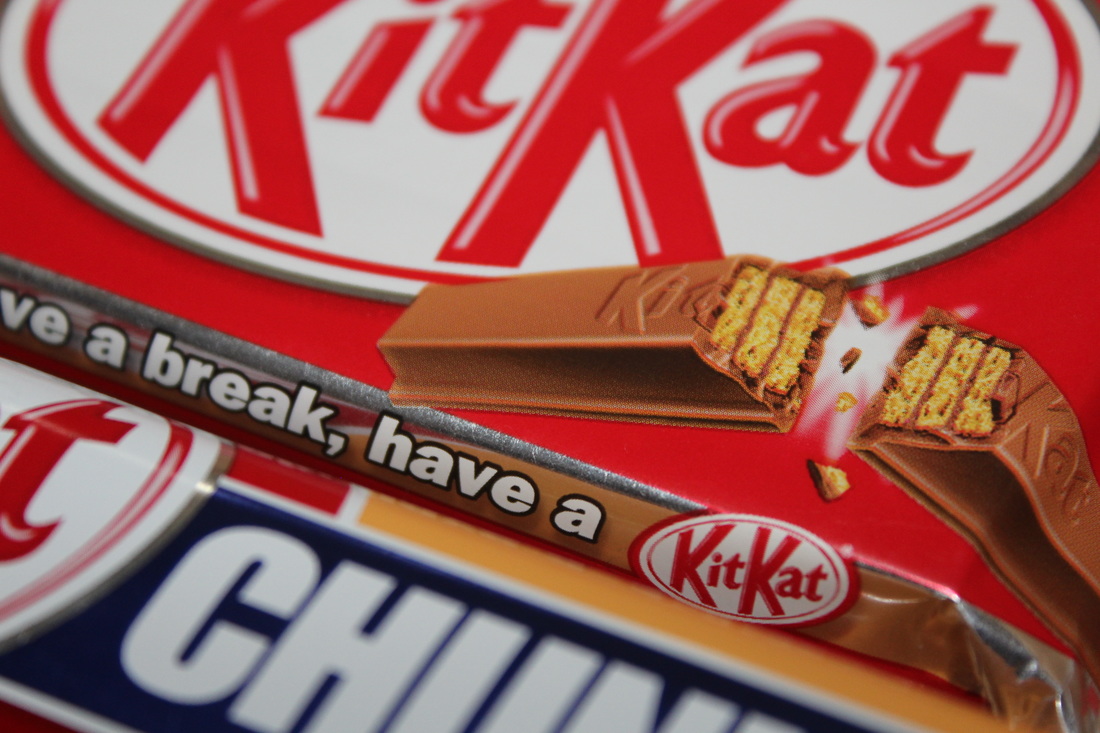
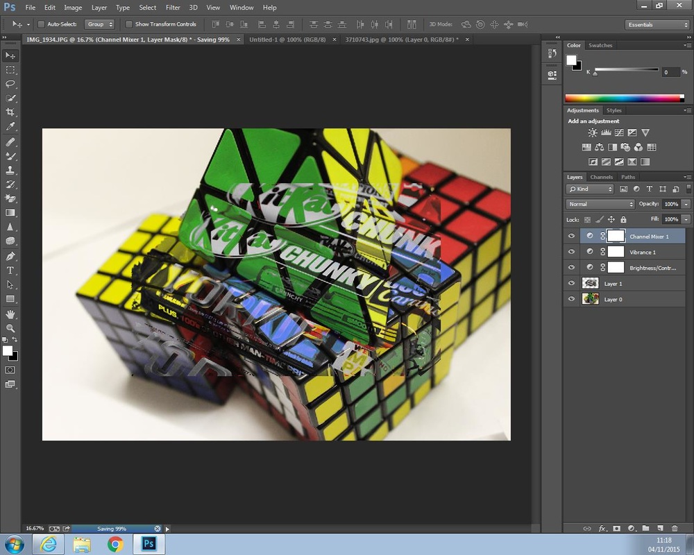
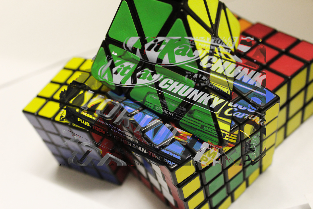
Within this photograph I was attempting to create an image which showed how different colours can make the audience create their own opinion and idea of what this photograph was intending to create. To put these two images together, I was trying to place the colours from the Rubik's cube on to the chocolate bars to see if the audience can think of the colours which actually demonstrate which brand these are. To complete these photo shoots, I used a Canon 1200D on the setting of close-up but I took these images from two different photo shoots and put them together to make one that connects to what the topic is about. One image was taken on a blank white sheet of paper where as the chocolate bars were taken in a box which was used for different styles to create in this photo shoot.
The work of Jillian Audrey influenced me in completing this piece due to the idea of how she uses a variety of colours to create a whole image with a lot of different meanings to it. However when putting these two images together I turned one dark on top of a colourful image which created a perspective of what the chocolate wrappers originally looked like. The tone was bright and by using Photoshop to make one bright and the other dark, it keeps it different and how I as the photographer wanted to make the image different.
I feel that the composition is effective due to the fact that I thought about how Jillian Audrey used the colour from a variety of things and by using something that has a range of colours in one object, it helps give the photo shoot my own personal touch. Once I had taken these photographs, I put them into Photoshop to see if the contrast of colours can represent an image of how I wanted to make the images stand out with different meanings. While using Photoshop I did not crop anything out but I changed how the chocolate bar photograph was darker in tone to make sure that when I overlaid it over the Rubik's cubes to see how these two relate to each other.
The contrast of colour within this piece shows how the brightness changed how the colours effects the edited wrappers of the chocolate bars. By making the chocolate bars have a darker tone with a monochrome look, it makes the writing stand out on the colours so the audience know what the photographer, myself, is trying to create when placing these pieces into Photoshop. The mood created by this edited piece, shows how I have thought about what I want to make of this topic but it lets the audience or the viewer think about how my work has inspired them or what I was trying to show through making this edit.
In order to refine and develop this piece I would try to blend these two images into each more to show the writing clearer but keep how these two have different tones.
